Case Study: Dr. Nor Jobarah- Chiropractic
Lizzy Moffett
The Challenge
When Dr. Nor came to me, her chiropractic practice already had loyal patients and a beautiful mission—but her website didn’t reflect the care she provides. The design felt dated, the flow was confusing, and she couldn’t easily make updates.
“I can’t believe I used WordPress for so long,” she laughed during our first meeting. “It just makes everything harder than it needs to be.”
Her goals were simple but meaningful: a site that felt modern, trustworthy, and easy to maintain. She wanted her patients (and soon-to-be patients) to instantly understand her unique approach to chiropractic care—one that’s gentle, evidence-based, and tailored for people who are highly sensitive or managing complex issues like migraines, vertigo, and chronic pain.
The Collaboration
From our first conversation, I could tell Dr. Nor was deeply intentional about how she serves her patients. That clarity made our design process move quickly.
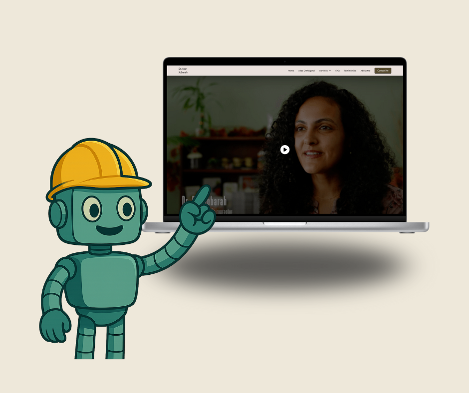
We started with her brand photography—a stunning mix of professional portraits and real-life practice shots—to bring warmth and humanity to every page. From there, we built her sitemap and wireframes to highlight her core service areas while keeping the experience calm and easy to navigate.
She made sharp, minimal choices—clean lines, sans-serif typography, and structured layouts—that reflect both professionalism and precision. Every element supports her brand promise: care that’s grounded, personalized, and deeply effective.
Because she offers a specialized chiropractic technique (Atlas Orthogonal), we dedicated a page explaining the method in clear, patient-friendly language. I also built a testimonial system that automatically rotates client stories, so visitors see new proof on every visit.
On the backend, we switched her to Webflow, giving her a streamlined editor where she can update photos, text, and testimonials on her own. “I can actually edit my own site now—and it looks good while I’m doing it,” she said during training.
The Transformation
The new site captures exactly what makes Dr. Nor’s practice different: grounded expertise with a personal touch. Patients can now:
- Quickly find information about conditions like migraines and vertigo
- Understand the Atlas Orthogonal method in plain English
- Request appointments through a simple, optimized contact form
- Read real patient testimonials that build trust immediately
The result feels calm, confident, and centered—just like walking into her office.
The Takeaway
A chiropractic website shouldn’t feel clinical or cold. It should reflect the care, warmth, and precision of the practitioner behind it.
Working with Dr. Nor was a reminder that when design and intention align, everything flows better—on the page and in real life.
If your current website feels out of alignment, let’s fix that!
Book a Good Fit Call and see how strategic design can help your practice grow with ease.