I don’t just build websites. I help small businesses grow.
Every site here is a custom tool designed to attract the right clients with confidence.Use the buttons below to explore examples and see the unique strategies behind each project.
.png)
Erica’s vision for Emotion Fitness was already magnetic: a bold mix of rage room, movement, and mindfulness. Her old site didn’t capture that energy or explain what made it special. We restructured the sitemap around her signature experience, Break Sh!t. Work Out. Chill.*, clarified the messaging, and rebuilt the entire site to tell her story with ease and confidence. Visitors can now see what Emotion Fitness offers, how to book, and why it matters within seconds.

Connie has built an incredible community of entrepreneurs who not only look up to her but are deeply grateful for the impact she’s had on their businesses—all without a website! Now, with a site that truly reflects her brand, communicates her message clearly, and is easy to update, she has a powerful platform to expand her reach even further. I can’t wait to see how this next chapter unfolds for her!

Jen had put real effort into building her own site, and her VA had been keeping it going, but it was cumbersome to update and it was not doing anything for her visibility. The site was not pulling in new clients through search, and the maintenance overhead was a constant drain on her time and attention.
We did a Design Sprint and rebuilt her site on Wix with a clean structure and a real SEO foundation underneath it. The goal was a site that worked harder for her business without requiring her to work harder to keep it running.
One of my favorite things about this build is the custom podcast widget. When Jen publishes a new episode, it automatically pulls in and displays on her site. No manual updates, no back-and-forth. It just works.
Jen is now on my Momentum Plan, which means her blog posts and podcast episodes get updated for her on a regular basis. She gets to focus on growing her community and showing up for her members, knowing her site is keeping pace with her.

With decades of expertise in Peaceful Parenting, Nancy needed a website that felt as trustworthy and supportive as her work.
We created a polished, welcoming site that balances authority with warmth and makes it easy for overwhelmed parents to find the right next step.
Features include simplified booking, clear coaching pathways, resource access, and room for future classes and digital products.
Now families can find support faster and move forward with confidence.

Jill came to me with a fresh new vision for her wine tasting business—something that felt polished and professional but still warm, welcoming, and never stuffy. Together, we built a brand and website that showcase her sommelier-level knowledge in a way that feels fun and deeply personal.
The final site is full of thoughtful touches: from curated event categories and a fully accessible newsletter opt-in to playful messaging and smart CMS structuring that supports future growth. We also integrated MailerLite and Calendly behind the scenes so Jill can spend less time on logistics and more time pouring joy into her events.

Desirèe came to me after years of running a thriving business and utilizing her brokerage's website. She was ready for a professional digital presence that felt warm, trustworthy, and truly her. Together, we created a site that guides visitors through the complexities of Medicare with clarity and compassion.
In just two days, we launched a site that’s not only user-friendly and compliant with Medicare marketing regulations, but also packed with personality—from her story and client testimonials to clear FAQs and a private client forms portal. Behind the scenes, it’s integrated with her CRM, newsletter platform, and event calendar to make her workflow smoother than ever.

Bonnie had spent years on her own website and never quite loved it. She kept telling herself it was good enough, but she was embarrassed to share it. That's the clearest sign a site isn't doing its job.
We built her original site and found a design she finally felt proud of. About 18 months later, her business had shifted. New offerings, new focus, new chapter. So we built again.
The second site came together faster because I already knew her voice, her brand, and what mattered most to her business. That's the real value of a relationship that goes beyond a single project.
Today Bonnie reaches out when her business needs something new. And because I already know her voice, her brand, and her history, we can move fast when she does.

Before this launch, Destiny had been running her business without a website, which made it harder to streamline her workflow and direct clients to one central place. Now, she has a beautiful, intuitive site that reflects her work and provides a seamless experience for those looking to step into their own transformation.With a dreamy aesthetic that mirrors her energy work, this site is more than just a digital space—it’s an extension of her mission. So excited for her to finally have a place where clients can easily explore her offerings, book sessions, and connect with her magic!

Meghan had a growing brand, powerful ideas, and multiple offers that needed stronger organization online.
We created a website built for clarity and expansion, helping visitors understand where to begin while giving her business room to evolve.
The site includes strategic navigation, integrated forms and booking paths, a blog system, and flexible pages for future programs.
Now her site supports growth instead of slowing it down.

Bobbie’s work was deep and meaningful, but her website needed to communicate that value more clearly and guide visitors toward action.
We refined her messaging, elevated the brand experience, and translated nuanced services into language that builds trust quickly.
The refreshed site includes dedicated service pages, strategic calls to action, an ongoing blog, and an updated Shift Mentoring experience.
Now visitors feel connected to her work and know exactly how to begin.
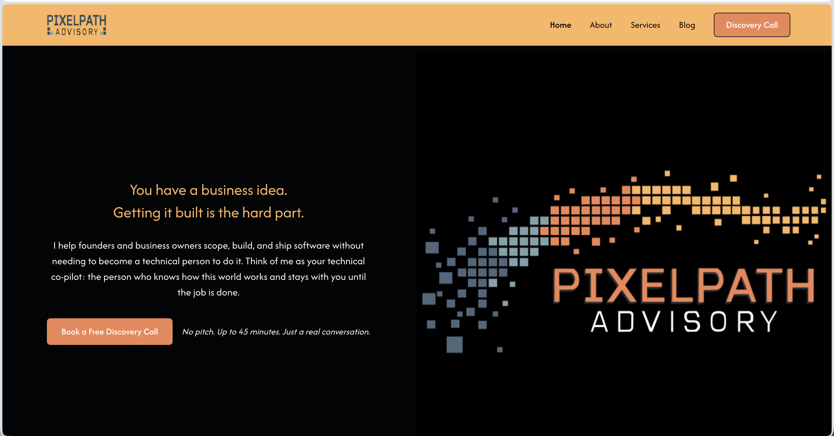
Micah came to me with a solid background, a clear service idea, and no brand to show for any of it. He had been operating informally and was ready to launch PixelPath Advisory LLC as a real business, but he had no logo, no website, no way to collect leads, and no system for onboarding clients. He also had a tendency to describe his work in technical terms his actual clients would never connect with.
I worked with Micah across the full brand and launch build: logo concepts, color palette, website copy for five pages structured around the StoryBrand framework, and a Webflow site build. I also set up a HoneyBook intake automation so his discovery call pipeline could run without him manually chasing every lead.
The copy work was where this project got interesting. Micah's instinct was to describe what he does in program management language. Getting him to speak directly to a non-technical founder, using words like "make sure you get what you paid for," changed the whole feel of the brand. That one phrase became the anchor for how we positioned his core value.
Micah launched with a brand identity, a live Webflow site, a working intake automation, and copy he could stand behind. The full system means he can send someone to his website today and have them booked into his pipeline without touching it himself.
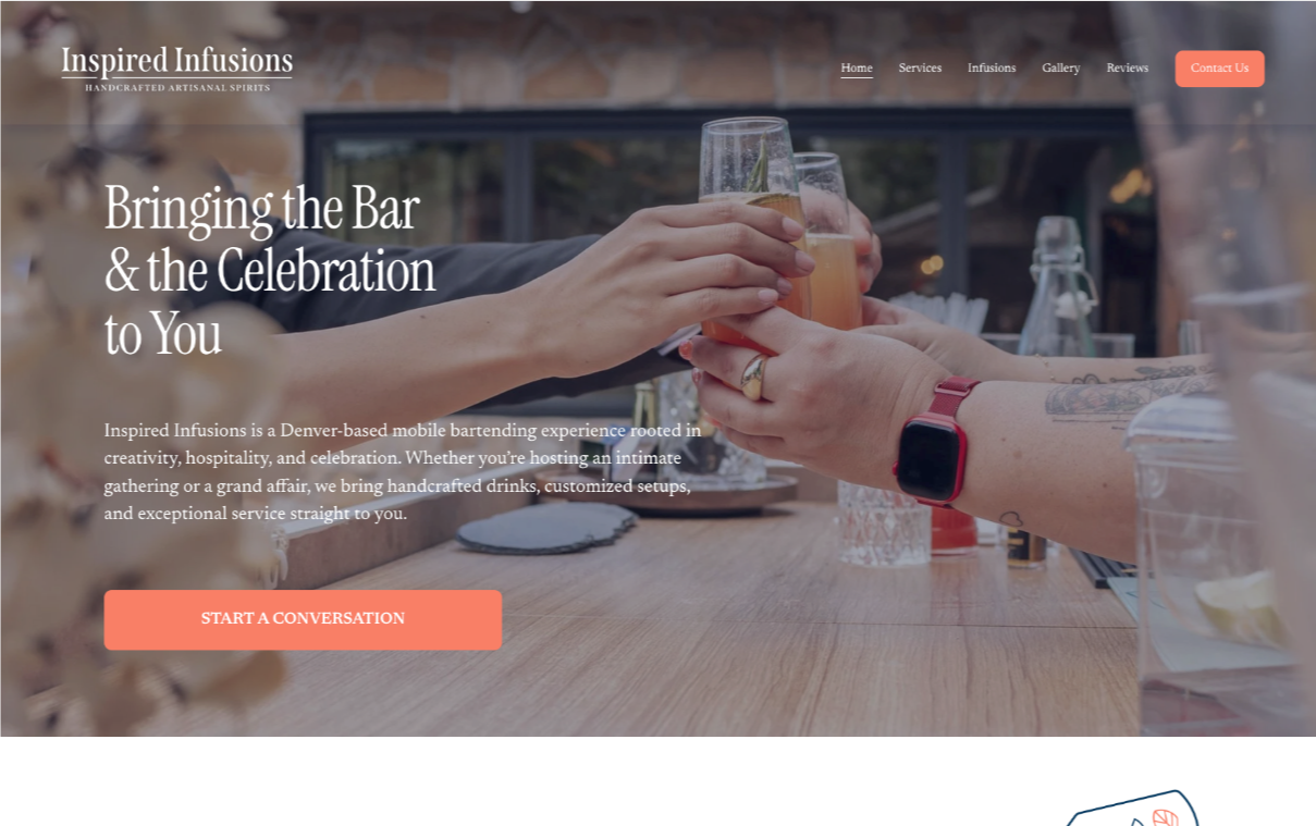
When Anita’s previous website builder stalled, she reached out in a panic. Her business was growing, but her site was holding her back. Within 48 hours, I rebuilt Inspired Infusions from the ground up on Squarespace, keeping her original content but giving it a cleaner, more reliable foundation.
A passion-fueled, thriving brand that was stuck behind tech limitations now has a platform that reflects its personality, functions beautifully, and can evolve as the business does.

Deb already had loyal clients and glowing reviews, but her website no longer matched the quality of the salon experience. It felt cluttered, dated, and harder to navigate than it should.
We refreshed the brand online with a warmer, more polished experience, improved mobile usability, and clearer paths to booking.
Highlights include a streamlined homepage, a testimonials page featuring 90+ client reviews, and an inspiration gallery organized by cuts, color, styling, and extensions.
Now new visitors can trust what they see quickly and book with confidence.

Tami and her team had built something genuinely powerful in literacy education. Their website just wasn't showing it. They weren't confident sharing the site, and that kind of hesitation is a quiet drain on every introduction and sales conversation.
We rebuilt with a clear structure around their offerings, a better experience for educators and school partners, and a foundation ready to grow.
The result spoke for itself. Their site has become the example Tami shows others when they ask what a good website looks like.
As Instructional Intensity's programs and focus continue to evolve, they're on the Momentum Plan. When the business shifts, the site shifts with it.
Allison was great at her job and not so great at keeping her website current at the same time. Running a college consulting business takes real focus, and updating blogs and events kept falling to the bottom of the list. Her site was technically there, but it wasn't working as hard as she was.
She joined my Momentum Plan, which means I take the site maintenance off her plate entirely. I handle her blog updates and keep her events current so she never has to worry about whether her site reflects what's actually going on in her business.
My favorite piece of this project is the class of pages I built for her. Instead of making parents scroll through a long service list, each grade level has its own landing page. A parent of a sophomore lands on the sophomore page and sees exactly what's available for their student. Clean, simple, and fast.
Since we started working together, Allison hasn't had to touch her site once. Her events are always up to date, her content is fresh, and she gets to stay focused on what she does best: helping families find the right college fit.
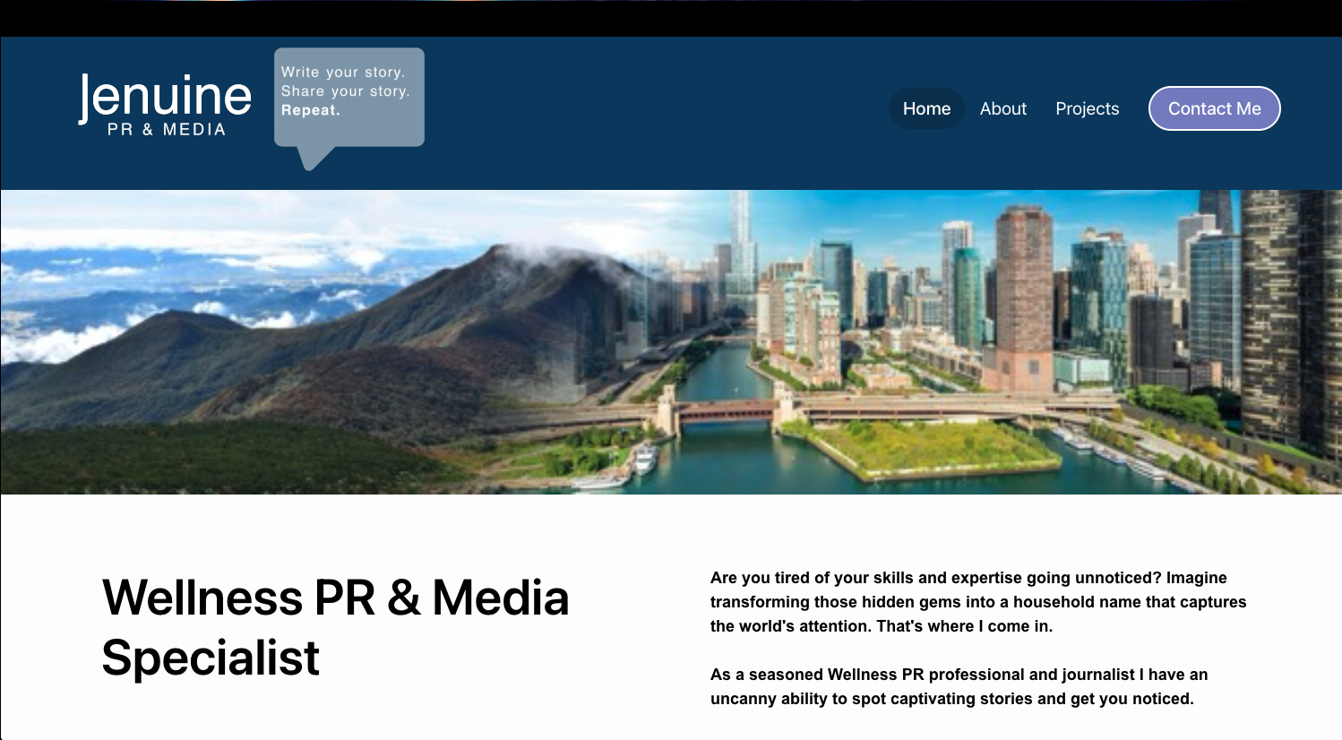
Jennifer had an established reputation in wellness PR, but her website needed to reflect the caliber of her results and make her value clear at a glance.
We elevated her digital presence with stronger messaging, cleaner design, and strategic proof points that highlight recognizable media wins.
The refreshed site guides visitors naturally toward contact while staying easy to update as new placements roll in.
Now her authority is visible within seconds.
Jennifer had a Wix site she cared about, but keeping it updated on her own had become a real source of frustration. Every small change felt like a project, and over time the site started to fall behind where her business actually was.
I came in for a design sprint and worked through updates across the site with a focus on experience and clarity. From page content to navigation flow, we made sure the site felt as thoughtful and grounded as the work Jennifer does for her clients.
The piece I am most proud of is not any single update. It is the shift in how Jennifer relates to her site. She now has a partner. When something feels confusing or out of date, she does not have to figure it out alone. Her site stays current because she has someone helping her brainstorm what needs to change and why.
Jennifer's site now reflects where she actually is in her business, and she has the support to keep it that way. She is not managing it solo anymore, and that peace of mind shows up in how she shows up online.
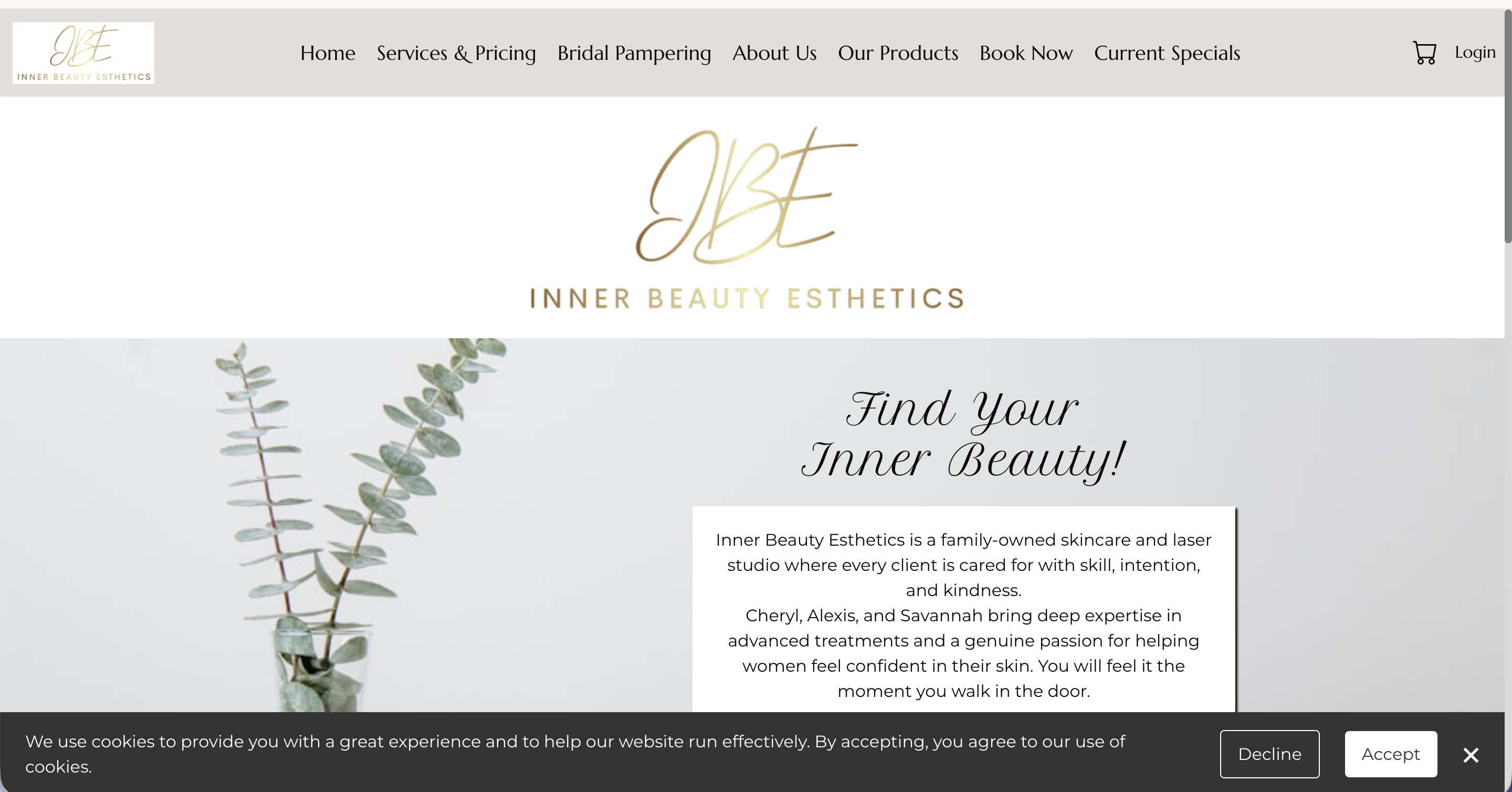
Inner Beauty Esthetics had a lot going for it already: strong services, beautiful photography, and a genuine story to tell as a family-owned mother-daughter business. What was missing was the foundation underneath. Key pages lacked title tags and meta descriptions, images had no alt text, header structure was inconsistent sitewide, and some of the most important content, including bridal packages, existed only inside graphics that search engines and screen readers couldn't read at all. The trust was there. The visibility and accessibility were not.
The work was a comprehensive SEO and accessibility optimization across the full site, part of an ongoing engagement. The homepage was rewritten and restructured to lead with the services and the family story, with testimonials integrated for social proof. Header hierarchy was corrected throughout, custom title tags and meta descriptions were written for every page, and alt text was added to images across the site. The About Us page was redesigned to better showcase the mother-daughter team, the Book Now page was enhanced with clearer booking guidance, and visual flow and readability were improved across multiple pages.
The Bridal Pampering page was the most impactful single change. A beautifully designed package graphic was holding all the bridal service information, which looked great but was completely invisible to search engines and screen readers. Converting that graphic into structured page content unlocked both accessibility and search visibility for bridal-related terms. Clients who couldn't previously find this information, or couldn't access it at all, now can.
The site kept its warmth and personality while gaining a much stronger foundation for organic search and inclusive access. Visitors can now more easily understand what's offered, connect with the family behind the business, and find their way to booking. The business is better positioned to attract new clients through search while providing a more welcoming experience for everyone who lands on the site. The relationship is ongoing, with periodic updates and optimization support as the business continues to grow.

As a brand-new event, Broomfield Home Expo needed instant credibility, strong vendor appeal, and a clear path to ticket sales.
We created a strategic one-page website that made the event feel established from day one, with polished branding, streamlined logistics, and a cohesive Eventbrite registration experience.
The site was built to flex quickly as details changed, including vendors, pricing, venue updates, and post-event messaging.
Now attendees and vendors can engage with confidence, and the brand is positioned for a bigger second year.
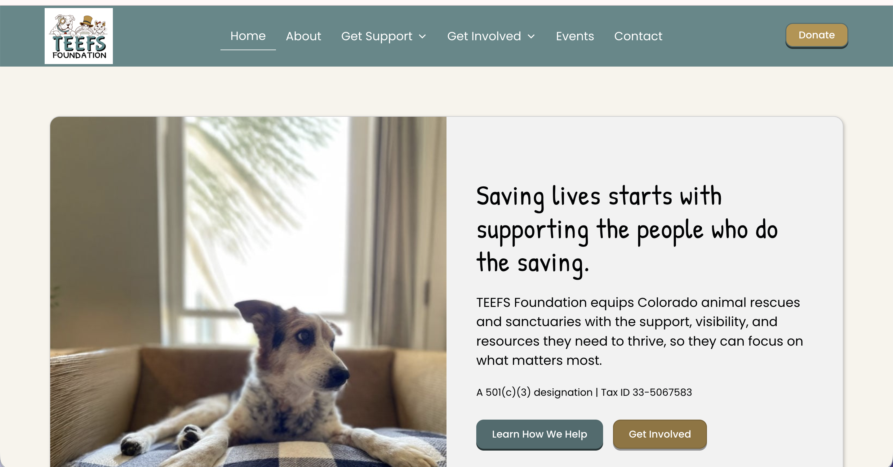
TEEFS Foundation launched as a brand-new Colorado nonprofit with a clear mission and a placeholder website that did nothing to reflect it. They had the structure, the heart, and the people in place, but nothing online that would make a rescue organization, a potential donor, or a community partner take them seriously from the start.
In a two-day build, I designed and built their full site in Webflow. The scope covered everything they needed for a confident launch: a home page, an about page, program pages for Heart of TEEFS and the Resource Library, donor-facing content, a Friends of TEEFS partnership page, events, contact, and a privacy policy.
The GiveButter integration was one of the most important pieces of this project. For a nonprofit, the donation step is a trust moment, and routing people to a disconnected third-party page can break that momentum fast. The site links directly to their GiveButter campaign in a way that feels cohesive with the brand, making it easy for donors to follow through.
TEEFS launched with a real web presence for the first time, one that reflects the credibility and care the organization was built on. We have stayed in an ongoing working relationship since, which means the site continues to grow alongside them.

Teresa runs a growing charter school, and the original website couldn't keep up. As the community expanded and staff turned over, maintaining the site became one more overwhelming task on an already full plate.
We built a custom Webflow site with a CMS designed specifically for how the school actually operates. When staff changes or a new event goes on the calendar, adding it to the site takes minutes, not a phone call to a developer.
Teresa said it best: every aspect of the site is now user-friendly and allows for immediate updates without spending hours figuring out how to make changes.
We continue to work together as the school grows. That's the kind of partnership a school community deserves.

David and his team were opening a restaurant and needed everything, a brand, a website, and a way to show the world what they were building. We started from scratch while the doors were still being hung.
The Big Lebowski theme gave us a creative direction that was genuinely fun to run with, but what made this project special was the people behind it. The passion David and his team bring to every new adventure comes through in everything they do, and I've had a front-row seat to it ever since.
Beyond the website, we built out logos, menus, and marketing materials that gave the brand a cohesive identity from day one.
When they reach out for updates, I never know what fun new chapter they're about to launch. That's the best kind of ongoing relationship.

Candace was running a thriving transaction coordination business with happy clients and no website. Anyone who went looking for her online found nothing.
We built a polished Webflow site that matches the professionalism of her service and gives real estate agents every reason to trust her before they ever get on a call.
The site lays out her services clearly, showcases feedback from agents who rely on her, and gives new visitors a direct path to booking a consultation.
Now when someone goes searching for transaction coordination support, Candace shows up. And her site does the convincing.

Melissa had built her own Wix site and hit her limit. It wasn't doing what she needed, and the time she was spending on it could have been spent on her clients.
In two days, we took that DIY foundation and rebuilt it into something she was genuinely proud of. Broken links fixed, formatting cleaned up, photos sized correctly, and a site that finally reflected the quality of her health coaching practice.
Melissa called it a masterpiece. What would have taken her months came together in two days.

Sheila came to me with a site that had been built by someone who then disappeared. Updates were impossible, and the design no longer reflected the warm, normalizing practice she had built or the clients she wanted to serve.
We built a brand-new Webflow site in two days and connected it seamlessly to her existing domain. The structure makes it easy for new clients to explore services and get to booking without any friction.
Sheila said it best: after working with multiple designers who never got it right, she finally had someone who included her in every step and delivered exactly what she asked for.
Now the site grows with the business. As Glow Up evolves, so does the site.
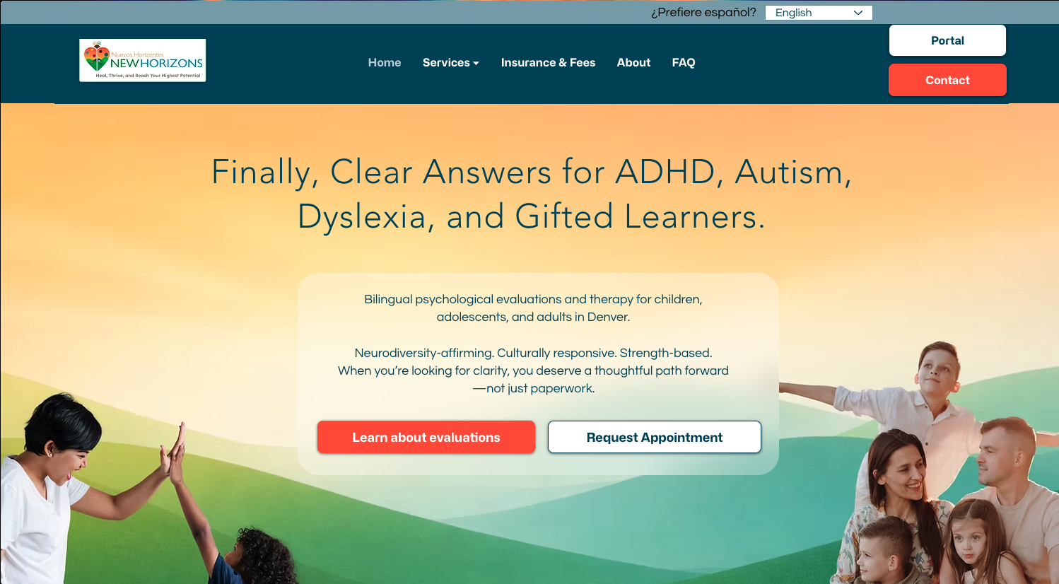
Dr. Pazos was ready for a stronger online presence that better matched the professionalism of her practice.
We rebuilt her site on a more flexible platform, improving SEO potential, usability, and the visitor journey for families, schools, and referral sources.
The new site includes bilingual English/Spanish content, dedicated service pages, clearer calls to action, and a more modern mobile experience.
Now visitors can understand services quickly and reach out with ease.

Austin knew his garage needed an online presence. He just wasn't sure what that looked like yet.
We worked through it together over two days. The result is a clean, professional Webflow site that highlights his services, builds trust through client testimonials, and features the educational video content he creates for his community.
The smartest piece: those videos pull automatically from YouTube. Austin adds a new video to his channel and it appears on the site without a second thought.
He wasn't sure what he wanted when we started. Now his site does the selling while he does the wrenching.

This website supports Balanced Behavior Consulting in its mission to empower parents and educators with effective strategies for improving children's quality of life. The Two-Day Website Build captured the vision of its founder, Cami Anderson, providing a professional and approachable online presence in record time.

Paula's site was holding together, but it had outgrown its structure. Everything important, her biography, media coverage, and resources, was buried inside a single long homepage, making it hard for visitors to scan or understand what she offered. The booking form was difficult to use, calls to action were easy to miss, and the site was still anchored to her previous work with DayBreak without clearly connecting visitors to her current focus, including the upcoming launch of A Place Like Home. For caregivers searching for support in an already stressful moment, none of that friction is workable.
Rather than a full rebuild, we did a strategic refresh inside Go High Level during a Design Sprint, reorganizing what was already there and building out what was missing. A dedicated About page and a dedicated Media page were created to pull key content out of the homepage and give it room to breathe. Navigation was simplified, calls to action were made more prominent, the booking form was repaired and resized, and page-specific SEO titles and meta descriptions were added throughout. Internal links connecting Never Alone Consulting to A Place Like Home were woven in to support both sides of Paula's work.
The most meaningful part of the project was helping Paula update her story. The revised About page honors the legacy of DayBreak and decades of dementia-care leadership, while making space for what comes next. A Place Like Home is now introduced in a way that feels connected rather than separate, so visitors can understand the full arc of Paula's work and where she's headed. That kind of narrative transition is easy to get wrong. This one landed well.
The site now reads more like a professional resource than a packed homepage. Visitors can quickly identify who Paula helps, what she offers, and how to reach her. The structure supports both her consulting practice and her ongoing leadership role as A Place Like Home takes shape. The relationship is continuing, with Paula reaching out for strategic support and website expertise as her next chapter unfolds.

A Place Like Home serves families with compassion and dignity during incredibly vulnerable seasons of life.
Their work providing adult day care and support services is vital—but before their website redesign, they didn’t have an easy, welcoming way to share their programs or connect with the families who needed them most.
We built a site that makes their mission clear and their services accessible.
Now, visitors can quickly find the information they need, whether they're exploring options for a loved one or reaching out for support.

This project is close to my heart. Bright Future Preschool was built as part of my Design That Gives Back pledge: for every three full-price websites I build, I put part of my time and resources toward a site for a business owner who is just getting started or needing technical assistance.
Shannon is a phenomenal teacher who pours herself into the next generation of learners. She had big ideas for what her site could be, and I believed in what she was building.
We created a colorful, welcoming site that reflects the school's joy and mission, gives parents the resources they need, and shows the community what Bright Future stands for.
Great design should stay within reach for people building something meaningful. This one was a privilege to make.

Jonathan needed more than an author website. He needed a platform that could launch his first book while establishing long-term authority as a speaker and thought leader.
We built a site that balances credibility, book promotion, and future growth.
Features include a custom homepage centered around his ideas, a sales-focused book page, and a speaking/media page ready for future opportunities.
Now visitors quickly understand who he is, what he stands for, and why his work matters.

David and the Lebowski's team were expanding beyond the taproom with a bottled product, and Kool Coffee Liqueur needed its own space to shine.
The site had to do several things at once: introduce the product, walk customers through what makes it special, connect them with merch and recipes, and build a brand identity that felt like a natural extension of the Taproom world while still standing on its own.
It's part of an ongoing relationship with a client who keeps dreaming bigger, and this site was built to grow right along with them.

Charlotte was launching P.U.L.S.E. Consulting and quickly found out that starting a business means wearing a dozen hats at once. Building a website was one task too many.
In two days, she had a polished, client-ready Squarespace site that communicated her expertise clearly and gave her a professional home base from day one.
The site covers her tiered consulting packages, a clear path to booking a discovery call, and a newsletter opt-in to grow her audience over time.
Charlotte arrived overwhelmed. She left with a site that was ready for clients.

Aurora found me through a networking community with a clear goal: stop explaining her business over and over in person and let her website do the work instead.
We built a warm, professional site for Teefs Pet Sitting that helps potential clients find her, learn about her services, and start the booking process without having to pick up the phone first.
Now Aurora can focus on what she actually loves, caring for pets, while her website handles the first impression.
Her energy going into the project matched her enthusiasm for the launch. She loved it so much that she brought Lizzy back for her husband's business rebrand too.
The church had a website. They just dreaded touching it. Updating it was frustrating enough that it often didn't get done, which meant the community wasn't getting the information they needed.
We built a new site from scratch, along with a fresh logo, and set up a structure that makes updates simple. Now the church is on the Momentum Plan. When something changes, they send it to me, and it's handled.
Paul Plinske summed it up simply: "Honestly, you can not go wrong with Lizzy."
The staff can focus entirely on their community now. The website is not their job anymore.
Mandy's business had grown in ways her website hadn't kept up with. Her services had evolved into distinct tiers of support, bookkeeping, consulting, and CFO-level work, but the site didn't reflect that progression. Visitors had no clear way to identify which level was right for them, and the site wasn't positioned to do much work between client conversations.
We completed a full redesign and restructure inside Go High Level during a Design Sprint, rebuilding the site across six pages: Home, About, Services, Contact, Blog, and a custom 404. We refined her service positioning to create clear pathways between each tier, integrated a lead magnet with automated delivery, migrated and organized her blog content, added SEO-focused FAQs, built internal anchor navigation between service sections, and set up custom redirects from legacy URLs. Updated branding assets and mobile-responsive design were carried through every page.
The most meaningful piece of this project wasn't a single page. It was a system. Visitors who aren't ready for ongoing services are now guided toward Mandy's Financially Focused Journal through strategic placement on the Services page and an exit-intent popup. A journal purchase triggers automated payment processing, order confirmation, business notifications, and fulfillment reminders. What had previously existed outside the site is now a fully integrated revenue stream that requires zero manual work on Mandy's end.
The finished site reflects Mandy's expertise, personality, and the full range of what she offers. Prospective clients can quickly identify the right level of support, and those who aren't ready for monthly services have a lower-commitment entry point into her world. The automations, payment systems, and lead nurturing running in the background reduce the manual work that used to fall on her plate. This is an ongoing client relationship, with continued support, updates, and future enhancements planned as her business grows.

Randy is a landscape artist capturing the beauty of Southern Colorado through oil painting, and he had built his own site to showcase his work. It had done its job for a while, but he knew it no longer reflected where his art had gone.
We rebuilt the gallery with a dynamic sorting and filtering experience that lets visitors explore his work the way art deserves to be explored, by subject, by mood, by what catches their eye.
The portfolio is the whole point. We built a site that gets out of the way and lets the paintings do the talking.

Thrifty Gents Floral needed a refreshed website to match the charm of their growing floral business. Transforming their outdated template into a customized design masterpiece, this site now showcases their work beautifully while enhancing credibility and customer trust.
.png)
Dr. Nor had built a strong foundation for her website, but tech frustrations and messaging gaps were holding her back.
Broken links, clunky updates, and uncertainty around layout made it hard for her to feel proud—or keep things fresh.
In just two days, we transformed her site into a beautiful, user-friendly space that truly reflects the quality of care she offers.
Her new five-page Webflow site makes it easy for clients to find what they need, gives her the power to update with ease, and works like a charm.

Monica had a half-finished site that had been sitting on her to-do list for a long time. She's an author with a clear mission, helping families navigate the experience of caring for elderly parents, and her online presence needed to match the care she puts into her work.
We built a site that draws from the visual language of her books, gives readers a clear picture of who she is and what she writes, and includes a Downloads section with practical tools for families in the middle of that journey.
Monica and I continue to work together as her goals evolve. When a new season of her business calls for a refresh, we make it happen.

At Deez Muttz LLC, they offer top-quality mobile pet grooming services that will keep your furry friend looking and feeling their best. The bold colors, passion for their work, and photos of adorable dogs made this project extra fun! (Who doesn't want to spend a day picking cute pup photos?)

Elizabeth has a passion for helping others build generational wealth, and she created Prosperity Through Property to make that education fun and accessible through a board game.
The site had to do a lot at once. It needed to introduce and sell the game, give real estate professionals a clear path to hosting their own game nights, and function as an interactive calculator so players can enjoy the full experience without stopping to do the math.
That calculator is the standout feature, built from scratch to keep players focused on strategy instead of arithmetic.
Now the site works as hard as the mission behind it.

The Hayworth family has been serving their community through Precision Hydraulics since 1975. Their website hadn't kept up. It was outdated, not mobile responsive, and not driving any traffic. Their expertise deserved better.
We refreshed the site completely, giving it vivid imagery, a polished layout, and a mobile-friendly build that actually works for how people search today.
What I didn't expect was how much fun a hydraulics site could be. The Hayworths are warm, passionate people who love what they do, and that comes through in every corner of the project.
Gina described the process as painless, which is exactly what a refresh like this should feel like.

Before this redesign, The Constant Cleaner was relying on an expensive CRM that was overkill for their needs. Now, they have a cost-effective, easy-to-update solution that allows them to manage their services without unnecessary complexity.Their new site highlights their residential and commercial cleaning services, makes it simple for clients to get in touch, and reflects their commitment to a spotless, stress-free experience.