2-Day
Websites
The two-day build is not a shortcut. It's a focused sprint where strategy comes first, design second, and everything else follows. From charter schools to wellness coaches to automotive shops, every two-day site starts with a real conversation about what the business needs and ends with something worth sharing. That's the whole point.
E·motion
.png)
Erica’s vision for Emotion Fitness was already magnetic: a bold mix of rage room, movement, and mindfulness. Her old site didn’t capture that energy or explain what made it special. We restructured the sitemap around her signature experience, Break Sh!t. Work Out. Chill.*, clarified the messaging, and rebuilt the entire site to tell her story with ease and confidence. Visitors can now see what Emotion Fitness offers, how to book, and why it matters within seconds.
Connie Kercher- Elite Entrepreneur Coach

Connie has built an incredible community of entrepreneurs who not only look up to her but are deeply grateful for the impact she’s had on their businesses—all without a website! Now, with a site that truly reflects her brand, communicates her message clearly, and is easy to update, she has a powerful platform to expand her reach even further. I can’t wait to see how this next chapter unfolds for her!
Dr. Nancy Buck

With decades of expertise in Peaceful Parenting, Nancy needed a website that felt as trustworthy and supportive as her work.
We created a polished, welcoming site that balances authority with warmth and makes it easy for overwhelmed parents to find the right next step.
Features include simplified booking, clear coaching pathways, resource access, and room for future classes and digital products.
Now families can find support faster and move forward with confidence.
Tasty Wandering

Jill came to me with a fresh new vision for her wine tasting business—something that felt polished and professional but still warm, welcoming, and never stuffy. Together, we built a brand and website that showcase her sommelier-level knowledge in a way that feels fun and deeply personal.
The final site is full of thoughtful touches: from curated event categories and a fully accessible newsletter opt-in to playful messaging and smart CMS structuring that supports future growth. We also integrated MailerLite and Calendly behind the scenes so Jill can spend less time on logistics and more time pouring joy into her events.
ReDiscover Insurance

Desirèe came to me after years of running a thriving business and utilizing her brokerage's website. She was ready for a professional digital presence that felt warm, trustworthy, and truly her. Together, we created a site that guides visitors through the complexities of Medicare with clarity and compassion.
In just two days, we launched a site that’s not only user-friendly and compliant with Medicare marketing regulations, but also packed with personality—from her story and client testimonials to clear FAQs and a private client forms portal. Behind the scenes, it’s integrated with her CRM, newsletter platform, and event calendar to make her workflow smoother than ever.
The Freely Me Journey

Bonnie had spent years on her own website and never quite loved it. She kept telling herself it was good enough, but she was embarrassed to share it. That's the clearest sign a site isn't doing its job.
We built her original site and found a design she finally felt proud of. About 18 months later, her business had shifted. New offerings, new focus, new chapter. So we built again.
The second site came together faster because I already knew her voice, her brand, and what mattered most to her business. That's the real value of a relationship that goes beyond a single project.
Today Bonnie reaches out when her business needs something new. And because I already know her voice, her brand, and her history, we can move fast when she does.
Your Magical Destiny

Before this launch, Destiny had been running her business without a website, which made it harder to streamline her workflow and direct clients to one central place. Now, she has a beautiful, intuitive site that reflects her work and provides a seamless experience for those looking to step into their own transformation.With a dreamy aesthetic that mirrors her energy work, this site is more than just a digital space—it’s an extension of her mission. So excited for her to finally have a place where clients can easily explore her offerings, book sessions, and connect with her magic!
Work the Way You're Wired

Meghan had a growing brand, powerful ideas, and multiple offers that needed stronger organization online.
We created a website built for clarity and expansion, helping visitors understand where to begin while giving her business room to evolve.
The site includes strategic navigation, integrated forms and booking paths, a blog system, and flexible pages for future programs.
Now her site supports growth instead of slowing it down.
Bobbie Jonas

Bobbie’s work was deep and meaningful, but her website needed to communicate that value more clearly and guide visitors toward action.
We refined her messaging, elevated the brand experience, and translated nuanced services into language that builds trust quickly.
The refreshed site includes dedicated service pages, strategic calls to action, an ongoing blog, and an updated Shift Mentoring experience.
Now visitors feel connected to her work and know exactly how to begin.
PixelPath Advisory
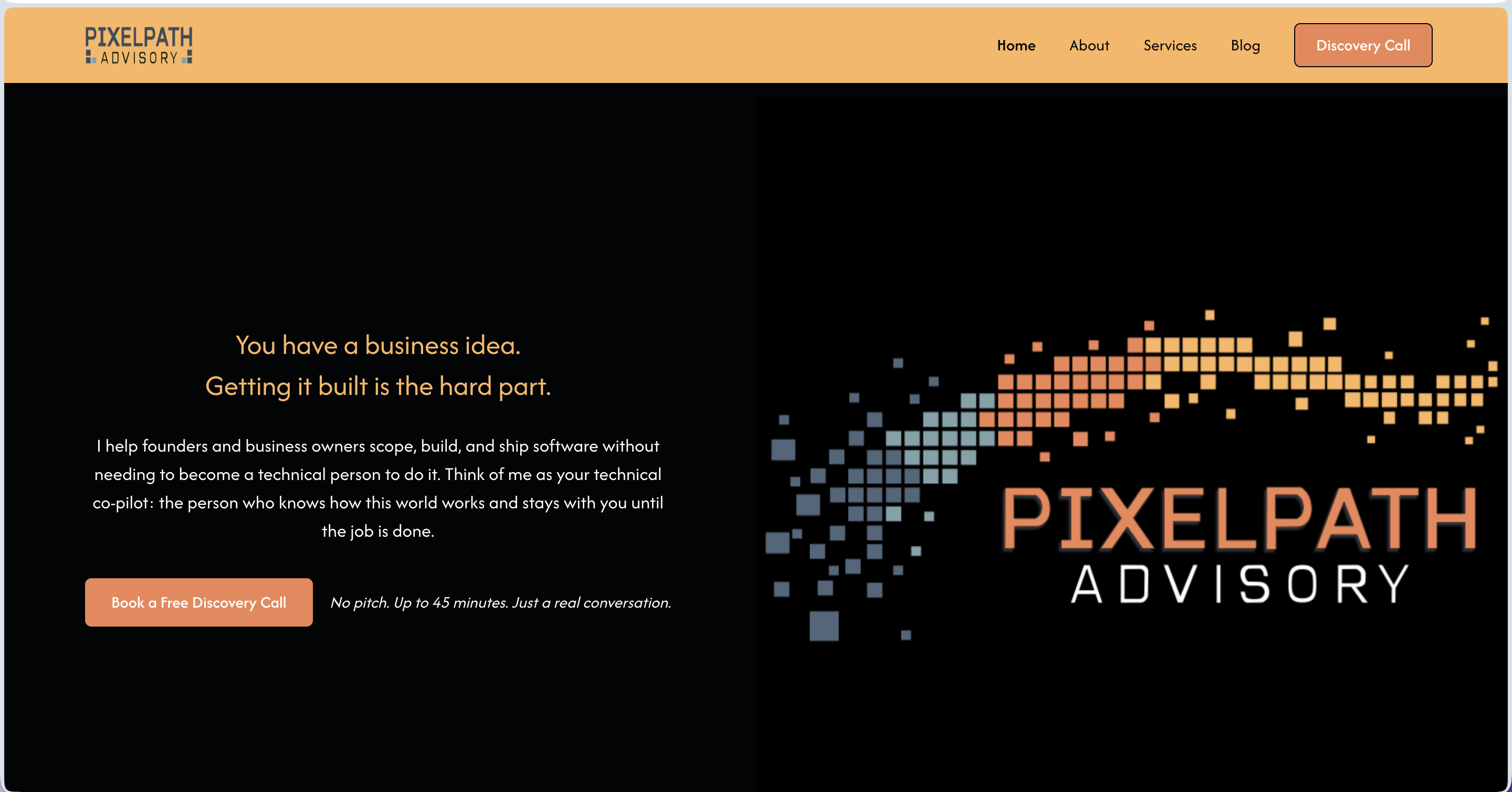
Micah came to me with a solid background, a clear service idea, and no brand to show for any of it. He had been operating informally and was ready to launch PixelPath Advisory LLC as a real business, but he had no logo, no website, no way to collect leads, and no system for onboarding clients. He also had a tendency to describe his work in technical terms his actual clients would never connect with.
I worked with Micah across the full brand and launch build: logo concepts, color palette, website copy for five pages structured around the StoryBrand framework, and a Webflow site build. I also set up a HoneyBook intake automation so his discovery call pipeline could run without him manually chasing every lead.
The copy work was where this project got interesting. Micah's instinct was to describe what he does in program management language. Getting him to speak directly to a non-technical founder, using words like "make sure you get what you paid for," changed the whole feel of the brand. That one phrase became the anchor for how we positioned his core value.
Micah launched with a brand identity, a live Webflow site, a working intake automation, and copy he could stand behind. The full system means he can send someone to his website today and have them booked into his pipeline without touching it himself.
Inspired Infusions LLC
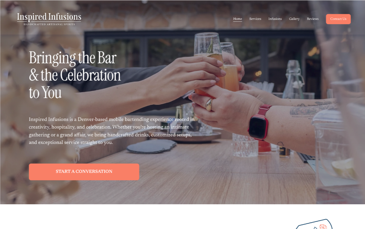
When Anita’s previous website builder stalled, she reached out in a panic. Her business was growing, but her site was holding her back. Within 48 hours, I rebuilt Inspired Infusions from the ground up on Squarespace, keeping her original content but giving it a cleaner, more reliable foundation.
A passion-fueled, thriving brand that was stuck behind tech limitations now has a platform that reflects its personality, functions beautifully, and can evolve as the business does.
Instructional Intensity, LLC

Tami and her team had built something genuinely powerful in literacy education. Their website just wasn't showing it. They weren't confident sharing the site, and that kind of hesitation is a quiet drain on every introduction and sales conversation.
We rebuilt with a clear structure around their offerings, a better experience for educators and school partners, and a foundation ready to grow.
The result spoke for itself. Their site has become the example Tami shows others when they ask what a good website looks like.
As Instructional Intensity's programs and focus continue to evolve, they're on the Momentum Plan. When the business shifts, the site shifts with it.
Jenuine PR & Marketing
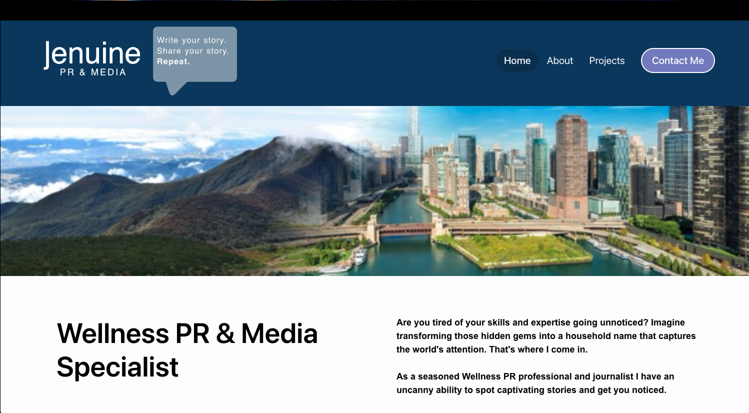
Jennifer had an established reputation in wellness PR, but her website needed to reflect the caliber of her results and make her value clear at a glance.
We elevated her digital presence with stronger messaging, cleaner design, and strategic proof points that highlight recognizable media wins.
The refreshed site guides visitors naturally toward contact while staying easy to update as new placements roll in.
Now her authority is visible within seconds.
Broomfield Home Expo

As a brand-new event, Broomfield Home Expo needed instant credibility, strong vendor appeal, and a clear path to ticket sales.
We created a strategic one-page website that made the event feel established from day one, with polished branding, streamlined logistics, and a cohesive Eventbrite registration experience.
The site was built to flex quickly as details changed, including vendors, pricing, venue updates, and post-event messaging.
Now attendees and vendors can engage with confidence, and the brand is positioned for a bigger second year.
TEEFS Foundation
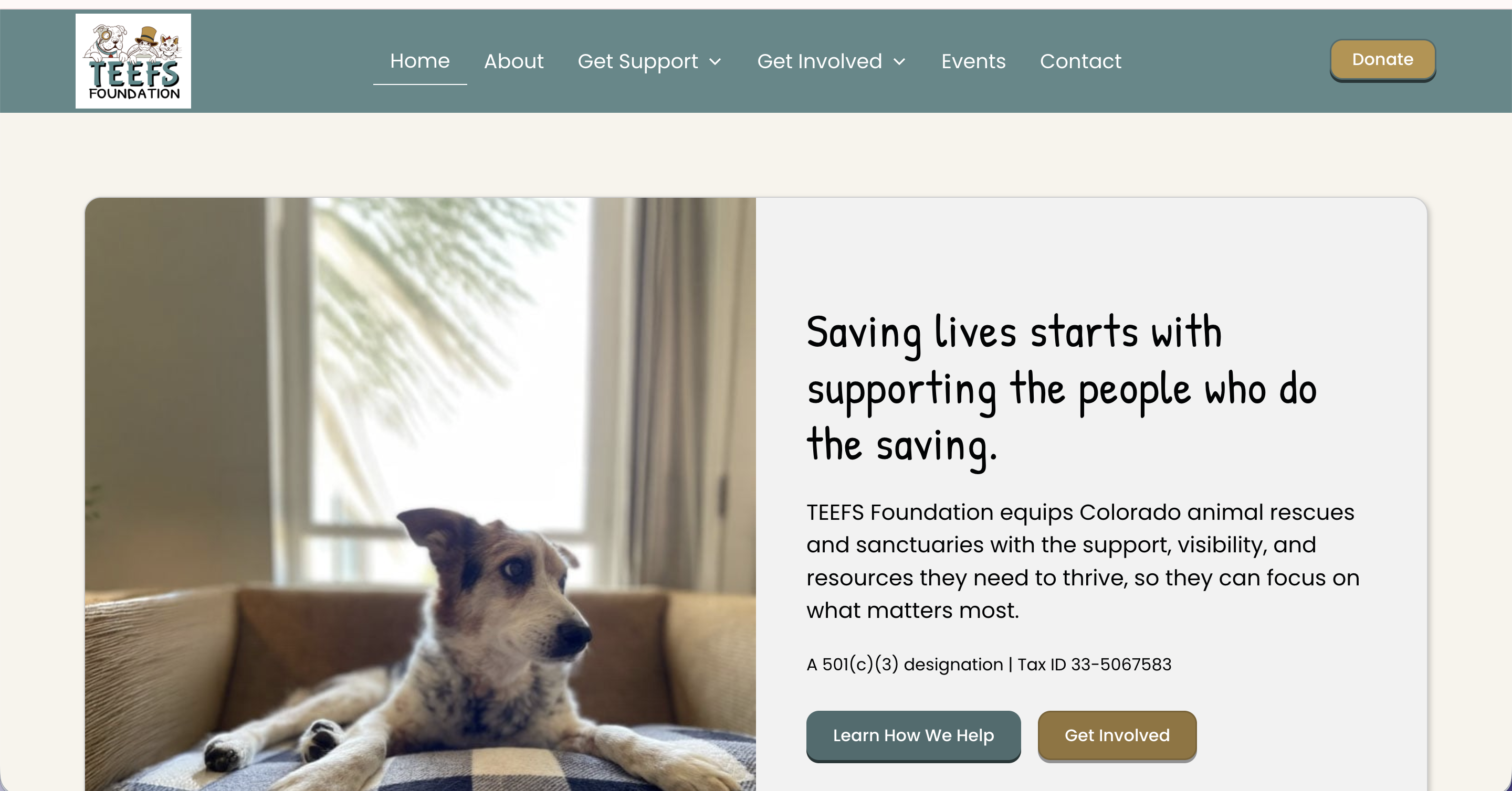
TEEFS Foundation launched as a brand-new Colorado nonprofit with a clear mission and a placeholder website that did nothing to reflect it. They had the structure, the heart, and the people in place, but nothing online that would make a rescue organization, a potential donor, or a community partner take them seriously from the start.
In a two-day build, I designed and built their full site in Webflow. The scope covered everything they needed for a confident launch: a home page, an about page, program pages for Heart of TEEFS and the Resource Library, donor-facing content, a Friends of TEEFS partnership page, events, contact, and a privacy policy.
The GiveButter integration was one of the most important pieces of this project. For a nonprofit, the donation step is a trust moment, and routing people to a disconnected third-party page can break that momentum fast. The site links directly to their GiveButter campaign in a way that feels cohesive with the brand, making it easy for donors to follow through.
TEEFS launched with a real web presence for the first time, one that reflects the credibility and care the organization was built on. We have stayed in an ongoing working relationship since, which means the site continues to grow alongside them.
Lebowski's Taproom

David and his team were opening a restaurant and needed everything, a brand, a website, and a way to show the world what they were building. We started from scratch while the doors were still being hung.
The Big Lebowski theme gave us a creative direction that was genuinely fun to run with, but what made this project special was the people behind it. The passion David and his team bring to every new adventure comes through in everything they do, and I've had a front-row seat to it ever since.
Beyond the website, we built out logos, menus, and marketing materials that gave the brand a cohesive identity from day one.
When they reach out for updates, I never know what fun new chapter they're about to launch. That's the best kind of ongoing relationship.
Dot Dash Docs

Candace was running a thriving transaction coordination business with happy clients and no website. Anyone who went looking for her online found nothing.
We built a polished Webflow site that matches the professionalism of her service and gives real estate agents every reason to trust her before they ever get on a call.
The site lays out her services clearly, showcases feedback from agents who rely on her, and gives new visitors a direct path to booking a consultation.
Now when someone goes searching for transaction coordination support, Candace shows up. And her site does the convincing.
Pursue Zen

Melissa had built her own Wix site and hit her limit. It wasn't doing what she needed, and the time she was spending on it could have been spent on her clients.
In two days, we took that DIY foundation and rebuilt it into something she was genuinely proud of. Broken links fixed, formatting cleaned up, photos sized correctly, and a site that finally reflected the quality of her health coaching practice.
Melissa called it a masterpiece. What would have taken her months came together in two days.
Glow Up Counseling and Consulting

Sheila came to me with a site that had been built by someone who then disappeared. Updates were impossible, and the design no longer reflected the warm, normalizing practice she had built or the clients she wanted to serve.
We built a brand-new Webflow site in two days and connected it seamlessly to her existing domain. The structure makes it easy for new clients to explore services and get to booking without any friction.
Sheila said it best: after working with multiple designers who never got it right, she finally had someone who included her in every step and delivered exactly what she asked for.
Now the site grows with the business. As Glow Up evolves, so does the site.
New Horizons | Nuevos Horizontes
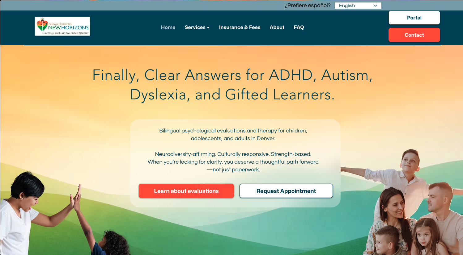
Dr. Pazos was ready for a stronger online presence that better matched the professionalism of her practice.
We rebuilt her site on a more flexible platform, improving SEO potential, usability, and the visitor journey for families, schools, and referral sources.
The new site includes bilingual English/Spanish content, dedicated service pages, clearer calls to action, and a more modern mobile experience.
Now visitors can understand services quickly and reach out with ease.
Austin's Speakeasy Garage

Austin knew his garage needed an online presence. He just wasn't sure what that looked like yet.
We worked through it together over two days. The result is a clean, professional Webflow site that highlights his services, builds trust through client testimonials, and features the educational video content he creates for his community.
The smartest piece: those videos pull automatically from YouTube. Austin adds a new video to his channel and it appears on the site without a second thought.
He wasn't sure what he wanted when we started. Now his site does the selling while he does the wrenching.
Balanced Behavior Consulting

This website supports Balanced Behavior Consulting in its mission to empower parents and educators with effective strategies for improving children's quality of life. The Two-Day Website Build captured the vision of its founder, Cami Anderson, providing a professional and approachable online presence in record time.
A Place Like Home

A Place Like Home serves families with compassion and dignity during incredibly vulnerable seasons of life.
Their work providing adult day care and support services is vital—but before their website redesign, they didn’t have an easy, welcoming way to share their programs or connect with the families who needed them most.
We built a site that makes their mission clear and their services accessible.
Now, visitors can quickly find the information they need, whether they're exploring options for a loved one or reaching out for support.
Bright Future Preschool

This project is close to my heart. Bright Future Preschool was built as part of my Design That Gives Back pledge: for every three full-price websites I build, I put part of my time and resources toward a site for a business owner who is just getting started or needing technical assistance.
Shannon is a phenomenal teacher who pours herself into the next generation of learners. She had big ideas for what her site could be, and I believed in what she was building.
We created a colorful, welcoming site that reflects the school's joy and mission, gives parents the resources they need, and shows the community what Bright Future stands for.
Great design should stay within reach for people building something meaningful. This one was a privilege to make.
Jonathan P. Morrow

Jonathan needed more than an author website. He needed a platform that could launch his first book while establishing long-term authority as a speaker and thought leader.
We built a site that balances credibility, book promotion, and future growth.
Features include a custom homepage centered around his ideas, a sales-focused book page, and a speaking/media page ready for future opportunities.
Now visitors quickly understand who he is, what he stands for, and why his work matters.
Lebowski's Kool Coffee Liqueur

David and the Lebowski's team were expanding beyond the taproom with a bottled product, and Kool Coffee Liqueur needed its own space to shine.
The site had to do several things at once: introduce the product, walk customers through what makes it special, connect them with merch and recipes, and build a brand identity that felt like a natural extension of the Taproom world while still standing on its own.
It's part of an ongoing relationship with a client who keeps dreaming bigger, and this site was built to grow right along with them.
P.U.L.S.E. Strategies

Charlotte was launching P.U.L.S.E. Consulting and quickly found out that starting a business means wearing a dozen hats at once. Building a website was one task too many.
In two days, she had a polished, client-ready Squarespace site that communicated her expertise clearly and gave her a professional home base from day one.
The site covers her tiered consulting packages, a clear path to booking a discovery call, and a newsletter opt-in to grow her audience over time.
Charlotte arrived overwhelmed. She left with a site that was ready for clients.
Teefs Pet Sitting

Aurora found me through a networking community with a clear goal: stop explaining her business over and over in person and let her website do the work instead.
We built a warm, professional site for Teefs Pet Sitting that helps potential clients find her, learn about her services, and start the booking process without having to pick up the phone first.
Now Aurora can focus on what she actually loves, caring for pets, while her website handles the first impression.
Her energy going into the project matched her enthusiasm for the launch. She loved it so much that she brought Lizzy back for her husband's business rebrand too.
Ascension Episcopal Church
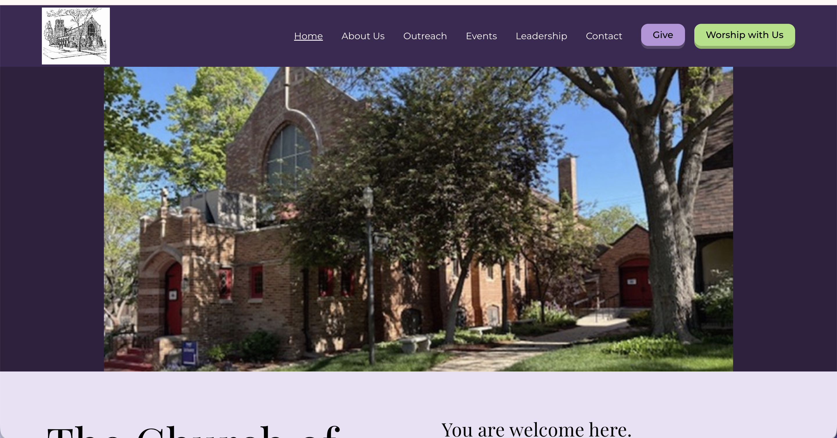
The church had a website. They just dreaded touching it. Updating it was frustrating enough that it often didn't get done, which meant the community wasn't getting the information they needed.
We built a new site from scratch, along with a fresh logo, and set up a structure that makes updates simple. Now the church is on the Momentum Plan. When something changes, they send it to me, and it's handled.
Paul Plinske summed it up simply: "Honestly, you can not go wrong with Lizzy."
The staff can focus entirely on their community now. The website is not their job anymore.
Randy Ford- Art Portfolio

Randy is a landscape artist capturing the beauty of Southern Colorado through oil painting, and he had built his own site to showcase his work. It had done its job for a while, but he knew it no longer reflected where his art had gone.
We rebuilt the gallery with a dynamic sorting and filtering experience that lets visitors explore his work the way art deserves to be explored, by subject, by mood, by what catches their eye.
The portfolio is the whole point. We built a site that gets out of the way and lets the paintings do the talking.
Thrify Gents

Thrifty Gents Floral needed a refreshed website to match the charm of their growing floral business. Transforming their outdated template into a customized design masterpiece, this site now showcases their work beautifully while enhancing credibility and customer trust.
Atlas Dr. Nor
.png)
Dr. Nor had built a strong foundation for her website, but tech frustrations and messaging gaps were holding her back.
Broken links, clunky updates, and uncertainty around layout made it hard for her to feel proud—or keep things fresh.
In just two days, we transformed her site into a beautiful, user-friendly space that truly reflects the quality of care she offers.
Her new five-page Webflow site makes it easy for clients to find what they need, gives her the power to update with ease, and works like a charm.
Elder Wisdom Press

Monica had a half-finished site that had been sitting on her to-do list for a long time. She's an author with a clear mission, helping families navigate the experience of caring for elderly parents, and her online presence needed to match the care she puts into her work.
We built a site that draws from the visual language of her books, gives readers a clear picture of who she is and what she writes, and includes a Downloads section with practical tools for families in the middle of that journey.
Monica and I continue to work together as her goals evolve. When a new season of her business calls for a refresh, we make it happen.
Deez Muttz Dog Grooming

At Deez Muttz LLC, they offer top-quality mobile pet grooming services that will keep your furry friend looking and feeling their best. The bold colors, passion for their work, and photos of adorable dogs made this project extra fun! (Who doesn't want to spend a day picking cute pup photos?)
Prosperity Through Property

Elizabeth has a passion for helping others build generational wealth, and she created Prosperity Through Property to make that education fun and accessible through a board game.
The site had to do a lot at once. It needed to introduce and sell the game, give real estate professionals a clear path to hosting their own game nights, and function as an interactive calculator so players can enjoy the full experience without stopping to do the math.
That calculator is the standout feature, built from scratch to keep players focused on strategy instead of arithmetic.
Now the site works as hard as the mission behind it.
Precision Hydraulics

The Hayworth family has been serving their community through Precision Hydraulics since 1975. Their website hadn't kept up. It was outdated, not mobile responsive, and not driving any traffic. Their expertise deserved better.
We refreshed the site completely, giving it vivid imagery, a polished layout, and a mobile-friendly build that actually works for how people search today.
What I didn't expect was how much fun a hydraulics site could be. The Hayworths are warm, passionate people who love what they do, and that comes through in every corner of the project.
Gina described the process as painless, which is exactly what a refresh like this should feel like.
The Constant Cleaner

Before this redesign, The Constant Cleaner was relying on an expensive CRM that was overkill for their needs. Now, they have a cost-effective, easy-to-update solution that allows them to manage their services without unnecessary complexity.Their new site highlights their residential and commercial cleaning services, makes it simple for clients to get in touch, and reflects their commitment to a spotless, stress-free experience.
Based in Brighton, Colorado and working with clients across the Denver metro and beyond, I build fully custom websites for solopreneurs, coaches, and small business owners who are ready to stop apologizing for their online presence. If you are in Denver, the suburbs, or anywhere in Colorado and your website has not kept up with your business, let's change that.