Nonprofit
Websites
Nonprofit websites have the hardest job: they have to communicate urgency, build trust, and inspire action, often with limited resources. A Place Like Home serves families during incredibly vulnerable seasons of life, and their site needed to make their mission clear so families could find help fast. Academy ACL is a growing charter school whose community outpaced the original site. Ascension Episcopal Church had a site their staff dreaded touching. Every one of these organizations deserved a website that works as hard as their team does.
TEEFS Foundation
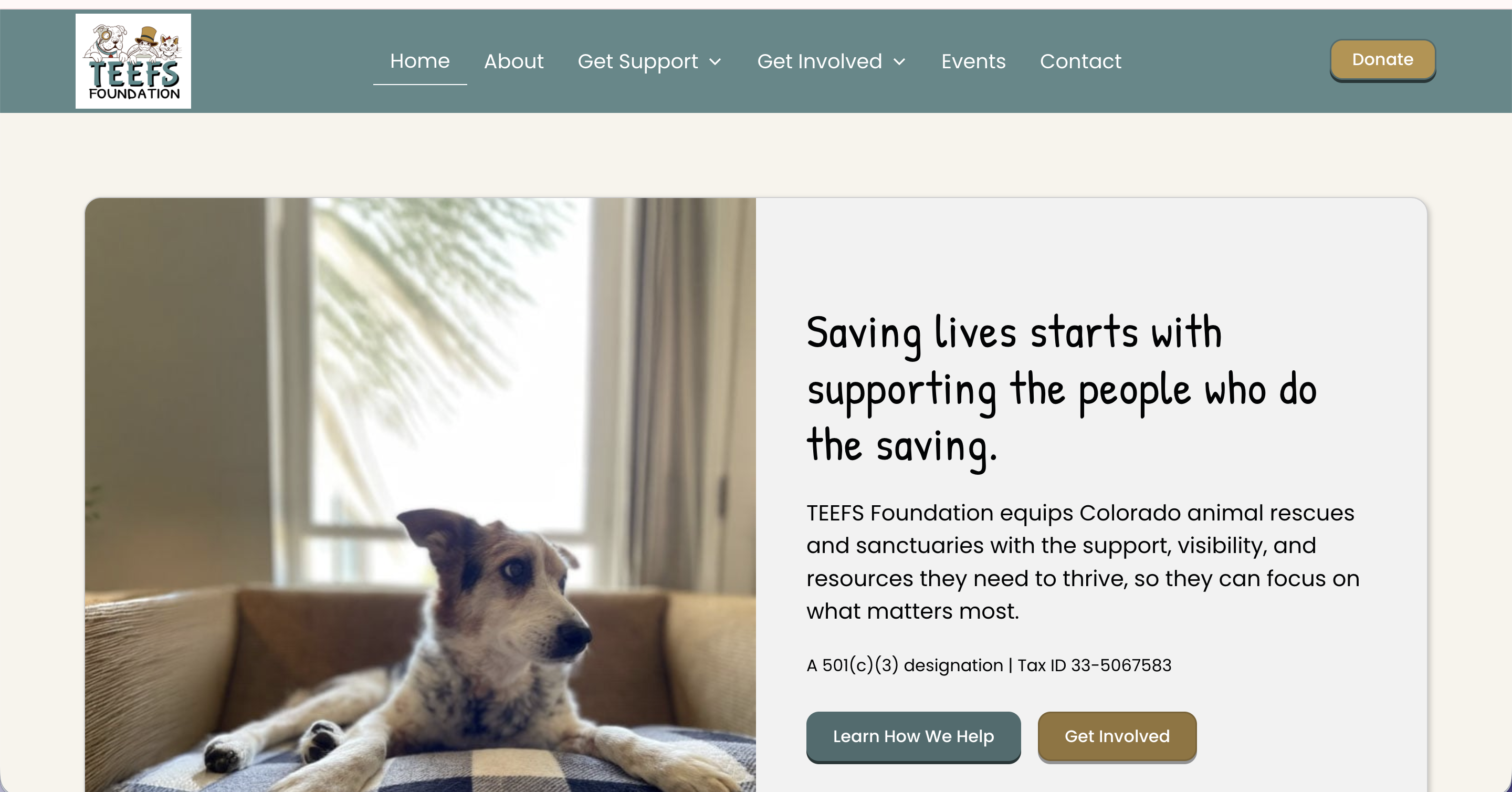
TEEFS Foundation launched as a brand-new Colorado nonprofit with a clear mission and a placeholder website that did nothing to reflect it. They had the structure, the heart, and the people in place, but nothing online that would make a rescue organization, a potential donor, or a community partner take them seriously from the start.
In a two-day build, I designed and built their full site in Webflow. The scope covered everything they needed for a confident launch: a home page, an about page, program pages for Heart of TEEFS and the Resource Library, donor-facing content, a Friends of TEEFS partnership page, events, contact, and a privacy policy.
The GiveButter integration was one of the most important pieces of this project. For a nonprofit, the donation step is a trust moment, and routing people to a disconnected third-party page can break that momentum fast. The site links directly to their GiveButter campaign in a way that feels cohesive with the brand, making it easy for donors to follow through.
TEEFS launched with a real web presence for the first time, one that reflects the credibility and care the organization was built on. We have stayed in an ongoing working relationship since, which means the site continues to grow alongside them.
Academy for Advanced and Creative Learning

Teresa runs a growing charter school, and the original website couldn't keep up. As the community expanded and staff turned over, maintaining the site became one more overwhelming task on an already full plate.
We built a custom Webflow site with a CMS designed specifically for how the school actually operates. When staff changes or a new event goes on the calendar, adding it to the site takes minutes, not a phone call to a developer.
Teresa said it best: every aspect of the site is now user-friendly and allows for immediate updates without spending hours figuring out how to make changes.
We continue to work together as the school grows. That's the kind of partnership a school community deserves.
Never Alone Consulting

Paula's site was holding together, but it had outgrown its structure. Everything important, her biography, media coverage, and resources, was buried inside a single long homepage, making it hard for visitors to scan or understand what she offered. The booking form was difficult to use, calls to action were easy to miss, and the site was still anchored to her previous work with DayBreak without clearly connecting visitors to her current focus, including the upcoming launch of A Place Like Home. For caregivers searching for support in an already stressful moment, none of that friction is workable.
Rather than a full rebuild, we did a strategic refresh inside Go High Level during a Design Sprint, reorganizing what was already there and building out what was missing. A dedicated About page and a dedicated Media page were created to pull key content out of the homepage and give it room to breathe. Navigation was simplified, calls to action were made more prominent, the booking form was repaired and resized, and page-specific SEO titles and meta descriptions were added throughout. Internal links connecting Never Alone Consulting to A Place Like Home were woven in to support both sides of Paula's work.
The most meaningful part of the project was helping Paula update her story. The revised About page honors the legacy of DayBreak and decades of dementia-care leadership, while making space for what comes next. A Place Like Home is now introduced in a way that feels connected rather than separate, so visitors can understand the full arc of Paula's work and where she's headed. That kind of narrative transition is easy to get wrong. This one landed well.
The site now reads more like a professional resource than a packed homepage. Visitors can quickly identify who Paula helps, what she offers, and how to reach her. The structure supports both her consulting practice and her ongoing leadership role as A Place Like Home takes shape. The relationship is continuing, with Paula reaching out for strategic support and website expertise as her next chapter unfolds.
A Place Like Home

A Place Like Home serves families with compassion and dignity during incredibly vulnerable seasons of life.
Their work providing adult day care and support services is vital—but before their website redesign, they didn’t have an easy, welcoming way to share their programs or connect with the families who needed them most.
We built a site that makes their mission clear and their services accessible.
Now, visitors can quickly find the information they need, whether they're exploring options for a loved one or reaching out for support.
Ascension Episcopal Church
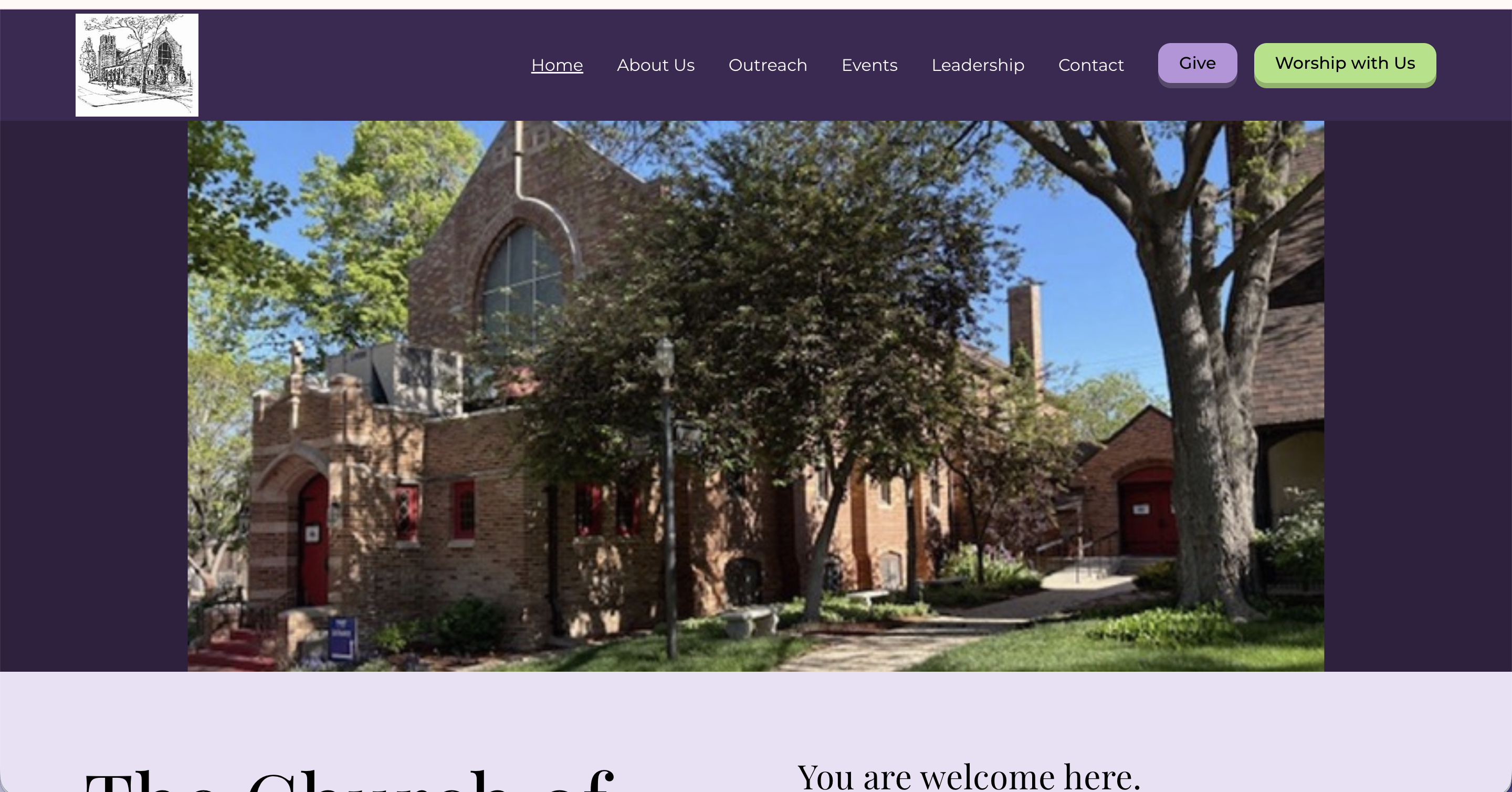
The church had a website. They just dreaded touching it. Updating it was frustrating enough that it often didn't get done, which meant the community wasn't getting the information they needed.
We built a new site from scratch, along with a fresh logo, and set up a structure that makes updates simple. Now the church is on the Momentum Plan. When something changes, they send it to me, and it's handled.
Paul Plinske summed it up simply: "Honestly, you can not go wrong with Lizzy."
The staff can focus entirely on their community now. The website is not their job anymore.
Based in Brighton, Colorado and working with clients across the Denver metro and beyond, I build fully custom websites for solopreneurs, coaches, and small business owners who are ready to stop apologizing for their online presence. If you are in Denver, the suburbs, or anywhere in Colorado and your website has not kept up with your business, let's change that.