Case Study: Building a Screen Reader Friendly Website
Lizzy Moffett
The Challenge
Beth Gustin has spent her career sitting with people in some of the hardest moments of their lives. As a licensed professional counselor and EMDR-certified therapist in Westminster, Colorado, she specializes in grief, loss, and life transitions. Her practice, Transitioning Through Change, PLLC, is a private pay space built on the belief that healing matters more than insurance hoops.
She shows up for her clients with steadiness, warmth, and zero judgment.
Her old website didn't show up for her.
Beth, totally blind, uses JAWS, a screen reader that converts on-screen content into audio and lets her navigate entirely by keyboard. Her previous site was built on a platform that gave her almost no ability to update it herself, and it was far from a screen reader friendly website. Very little of it was structured in a way that made sense when read aloud.
She was maintaining a digital front door she had never been able to walk through herself. What her clients were actually encountering when they landed there was harder to know than it should have been.
She came to me wanting to change that.
The Collaboration
From our very first conversation, I could tell Beth is deliberate in a way that her clients probably feel immediately.
She was careful about the language she chose for her site. She wanted every phrase to land softly for someone who was already in pain. She'd revisit a line of copy and ask whether a certain word might unintentionally leave someone out. That kind of attention doesn't happen by accident. It's the same care she brings into her sessions, and it set the tone for how I wanted to approach the technical side of this build.
We rebuilt everything from scratch in Webflow, which gave Beth a CMS structure designed with her in mind. But the real work was in every detail underneath the surface.
Accessibility was not a feature we added at the end. It was the foundation every decision was built on. That meant thinking through things most designers never touch: every image on the site has descriptive alt text written to paint a picture when read aloud, not just "image." Every social media icon is individually labeled, because as Beth told me, "So many sites just have a social media bar, and all I hear is link, link, link." Every heading is in the right hierarchy. The FAQ accordion announces whether it is expanded or collapsed. The skip-to-main-content link drops her exactly where it should.
And every "Learn More" button on every service page is coded to say "Learn more about grief counseling" or "Learn more about pet loss counseling," because if you are navigating by link list, hearing "learn more, learn more, learn more" over and over tells you absolutely nothing about where you are going.
Beth wasn't sure that last one was even possible. "I don't know if it means it can't be done," she said, "or if no one has just taken the time to do it."
That sentence became a challenge I couldn't let go of.
The Reveal
A typical reveal is visual. There is a moment where the site goes up and I say: here it is. Take a look.
With Beth, that moment sounded different.
At the start of our launch meeting, I made a decision: I didn't want to watch her screen. I wanted to hear her site the way she hears it. She agreed, and for the next hour, she narrated JAWS reading her website back to her, line by line, heading by heading, link by link. I sat on the other side of the call and followed along in my head.
That was my reveal.
When JAWS hit the footer and read "Visit Beth's Facebook" and "Visit Beth's Instagram" as distinct, labeled links, she said, "I like how you labeled these. So many sites just have link, link, link." When the FAQ expanded correctly and announced its state out loud, I said "yay" out loud on the call. The navigation read clearly. The headings made sense. The skip link worked.
"It's very, very close to being really nicely accessible," she told me near the end of our session. "I appreciate all the effort you put into that."
Close wasn't close enough for me. After our call I went back in. The FAQ accordion needed more work. The link labels needed another pass. I kept going until "very, very close" became something I could actually stand behind.
Before our call, I had run every page through a WAVE accessibility tester and scored a 9.4 out of 10 across the board. When I told Beth, she said it was really impressive. I told her it felt like bringing home a straight A report card, the kind you want to hang on the refrigerator.
What I Carry Forward
Beth said something during the build that has stayed with me.
"That's the problem with accessibility. It is such a time investment. That's why most designers don't do it."
She said it matter-of-factly, without bitterness. She's navigated that reality long enough to know exactly how that calculation gets made.
But here is what I learned building a screen reader friendly website: every decision we made for JAWS made the site better for everyone. The labeled icons. The descriptive link text. The logical heading structure. The intentional alt text. None of it is a workaround. It is just good design that doesn't leave people out.
I'll think about that now on every build. When I am writing a button label or setting up a nav structure or deciding how to break up a paragraph, I am thinking about the full range of people who might need that decision to make sense. A site should work for the person who hired you. That feels like the minimum.
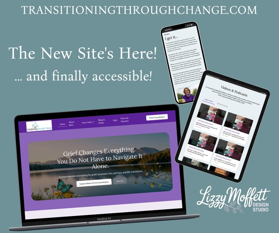
The Site
Beth's site does not look like an accessibility project. It looks like the practice it represents.
The palette is soft teal and warm purple. The photography is Colorado mountains at golden hour, wide open and peaceful, the kind of landscape that feels like a long exhale. The copy is Beth's voice: warm, grounded, unhurried. She writes lines like "You are not broken. What you're feeling makes sense." And she means them.
When someone lands on her site for the first time, in a moment when they are probably searching from a hard place, they will feel the steadiness she offers before they ever reach out to schedule a consultation. That was always the goal.
We just made sure she could feel it too.
Beth Gustin, LPC, EMDR Certified, is the founder of Transitioning Through Change, PLLC in Westminster, Colorado. She specializes in grief, trauma, and life transitions, and co-hosts the Wellness Wednesday podcast through Blind Abilities.