Design Sprint
Websites
Not every website needs to be rebuilt from scratch. Sometimes a focused sprint is exactly what's needed. Deb at Tangles Salon had loyal clients and glowing reviews but a site that no longer matched the quality of the experience. In a half-day sprint, we refreshed the brand online, improved mobile usability, and created clearer paths to booking. A Design Sprint is a dedicated block of time to make real progress without the full commitment of a two-day build.
Tangles Salon

Deb already had loyal clients and glowing reviews, but her website no longer matched the quality of the salon experience. It felt cluttered, dated, and harder to navigate than it should.
We refreshed the brand online with a warmer, more polished experience, improved mobile usability, and clearer paths to booking.
Highlights include a streamlined homepage, a testimonials page featuring 90+ client reviews, and an inspiration gallery organized by cuts, color, styling, and extensions.
Now new visitors can trust what they see quickly and book with confidence.
Jennifer Clair Astrology

Jennifer had a Wix site she cared about, but keeping it updated on her own had become a real source of frustration. Every small change felt like a project, and over time the site started to fall behind where her business actually was.
I came in for a design sprint and worked through updates across the site with a focus on experience and clarity. From page content to navigation flow, we made sure the site felt as thoughtful and grounded as the work Jennifer does for her clients.
The piece I am most proud of is not any single update. It is the shift in how Jennifer relates to her site. She now has a partner. When something feels confusing or out of date, she does not have to figure it out alone. Her site stays current because she has someone helping her brainstorm what needs to change and why.
Jennifer's site now reflects where she actually is in her business, and she has the support to keep it that way. She is not managing it solo anymore, and that peace of mind shows up in how she shows up online.
Never Alone Consulting

Paula's site was holding together, but it had outgrown its structure. Everything important, her biography, media coverage, and resources, was buried inside a single long homepage, making it hard for visitors to scan or understand what she offered. The booking form was difficult to use, calls to action were easy to miss, and the site was still anchored to her previous work with DayBreak without clearly connecting visitors to her current focus, including the upcoming launch of A Place Like Home. For caregivers searching for support in an already stressful moment, none of that friction is workable.
Rather than a full rebuild, we did a strategic refresh inside Go High Level during a Design Sprint, reorganizing what was already there and building out what was missing. A dedicated About page and a dedicated Media page were created to pull key content out of the homepage and give it room to breathe. Navigation was simplified, calls to action were made more prominent, the booking form was repaired and resized, and page-specific SEO titles and meta descriptions were added throughout. Internal links connecting Never Alone Consulting to A Place Like Home were woven in to support both sides of Paula's work.
The most meaningful part of the project was helping Paula update her story. The revised About page honors the legacy of DayBreak and decades of dementia-care leadership, while making space for what comes next. A Place Like Home is now introduced in a way that feels connected rather than separate, so visitors can understand the full arc of Paula's work and where she's headed. That kind of narrative transition is easy to get wrong. This one landed well.
The site now reads more like a professional resource than a packed homepage. Visitors can quickly identify who Paula helps, what she offers, and how to reach her. The structure supports both her consulting practice and her ongoing leadership role as A Place Like Home takes shape. The relationship is continuing, with Paula reaching out for strategic support and website expertise as her next chapter unfolds.
Elevating Profits LLC
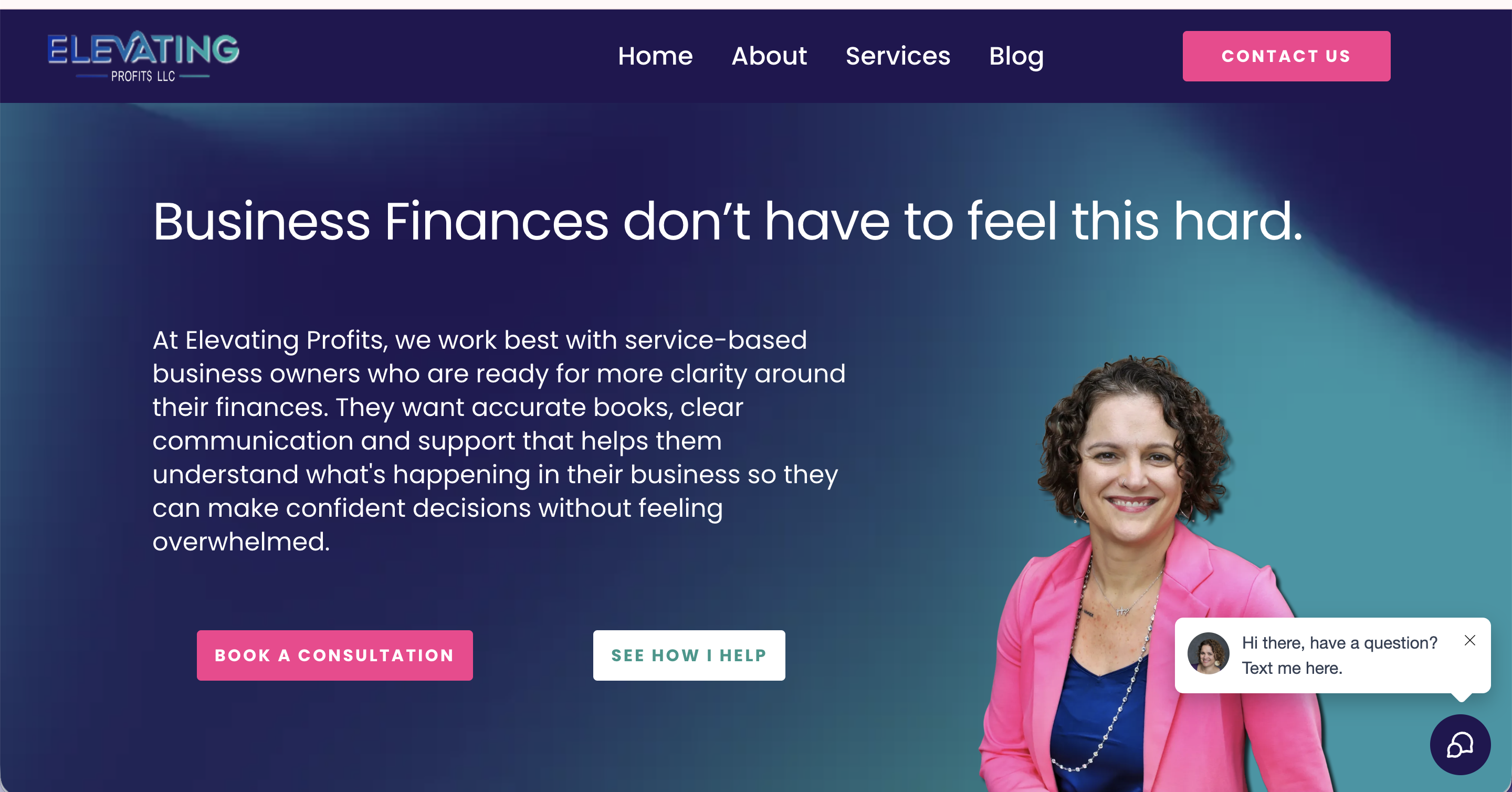
Mandy's business had grown in ways her website hadn't kept up with. Her services had evolved into distinct tiers of support, bookkeeping, consulting, and CFO-level work, but the site didn't reflect that progression. Visitors had no clear way to identify which level was right for them, and the site wasn't positioned to do much work between client conversations.
We completed a full redesign and restructure inside Go High Level during a Design Sprint, rebuilding the site across six pages: Home, About, Services, Contact, Blog, and a custom 404. We refined her service positioning to create clear pathways between each tier, integrated a lead magnet with automated delivery, migrated and organized her blog content, added SEO-focused FAQs, built internal anchor navigation between service sections, and set up custom redirects from legacy URLs. Updated branding assets and mobile-responsive design were carried through every page.
The most meaningful piece of this project wasn't a single page. It was a system. Visitors who aren't ready for ongoing services are now guided toward Mandy's Financially Focused Journal through strategic placement on the Services page and an exit-intent popup. A journal purchase triggers automated payment processing, order confirmation, business notifications, and fulfillment reminders. What had previously existed outside the site is now a fully integrated revenue stream that requires zero manual work on Mandy's end.
The finished site reflects Mandy's expertise, personality, and the full range of what she offers. Prospective clients can quickly identify the right level of support, and those who aren't ready for monthly services have a lower-commitment entry point into her world. The automations, payment systems, and lead nurturing running in the background reduce the manual work that used to fall on her plate. This is an ongoing client relationship, with continued support, updates, and future enhancements planned as her business grows.
Milk'd Up
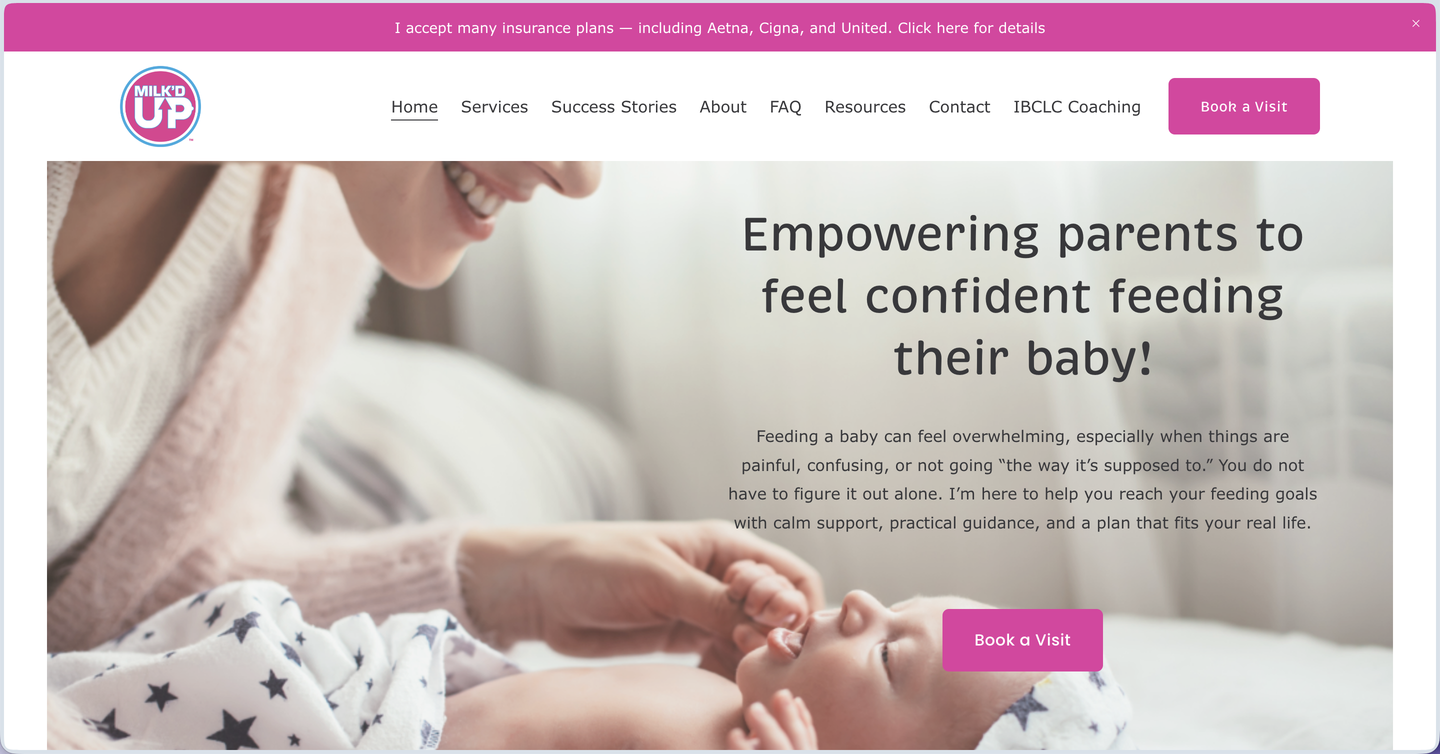
Kristen came to me with a site that already looked good. A designer built it a few years back and it still photographed beautifully, but her business had outgrown it. Kristen is an IBCLC who serves two very different audiences: parents who need feeding support, and fellow lactation professionals in her LFG program. The old site tried to talk to both at once. Her classes and events had nowhere clean to live, her provider program had no real home, and the navigation asked visitors to do too much sorting on their own.
We tackled this as a one-day sprint on Squarespace, which let us sharpen what was already working without the cost or disruption of a full rebuild. I restructured the homepage around a clear, parent-focused flow, simplified the booking path so people stop second-guessing which option to choose, and built a dedicated LFG page for her provider audience. Then I cleaned up the navigation so parents and providers each have their own clear path, and added a new "What Parents Say" page so her real client stories finally had a place to shine.
My favorite piece was rebuilding her resources page so she can keep it current on her own. Kristen wanted one spot for her favorite books, podcasts, and products for both parents and providers, and she wanted to add to it anytime without needing me. I structured it for exactly that, then recorded a short walkthrough video so updating it never feels intimidating. She owns that page now, and it will grow right alongside her practice.
Kristen's site finally matches how far her business has come. Parents land on a clear path to book, providers have a page that speaks straight to them, and her on-page SEO score reached 100 percent, with FAQ schema and accessibility fixes helping the right people find her. She walked away with a site that fits her business today, and I am in her corner whenever the next chapter calls for another round.
Based in Brighton, Colorado and working with clients across the Denver metro and beyond, I build fully custom websites for solopreneurs, coaches, and small business owners who are ready to stop apologizing for their online presence. If you are in Denver, the suburbs, or anywhere in Colorado and your website has not kept up with your business, let's change that.
