Solopreneur
Websites
Solopreneurs build entire businesses on their own expertise, their own relationships, and their own reputation. The website should carry that same weight. Connie Kercher had built a community of grateful entrepreneurs without a single web page to her name. Jill at Tasty Wandering runs sommelier-level wine events and needed a site as curated as the experiences she creates. Aurora at Teefs Pet Sitting wanted to stop explaining her business over and over and let her site do the work. When you have built something real, your website should show it.
Renegade Motherhood

Jen had put real effort into building her own site, and her VA had been keeping it going, but it was cumbersome to update and it was not doing anything for her visibility. The site was not pulling in new clients through search, and the maintenance overhead was a constant drain on her time and attention.
We did a Design Sprint and rebuilt her site on Wix with a clean structure and a real SEO foundation underneath it. The goal was a site that worked harder for her business without requiring her to work harder to keep it running.
One of my favorite things about this build is the custom podcast widget. When Jen publishes a new episode, it automatically pulls in and displays on her site. No manual updates, no back-and-forth. It just works.
Jen is now on my Momentum Plan, which means her blog posts and podcast episodes get updated for her on a regular basis. She gets to focus on growing her community and showing up for her members, knowing her site is keeping pace with her.
PixelPath Advisory
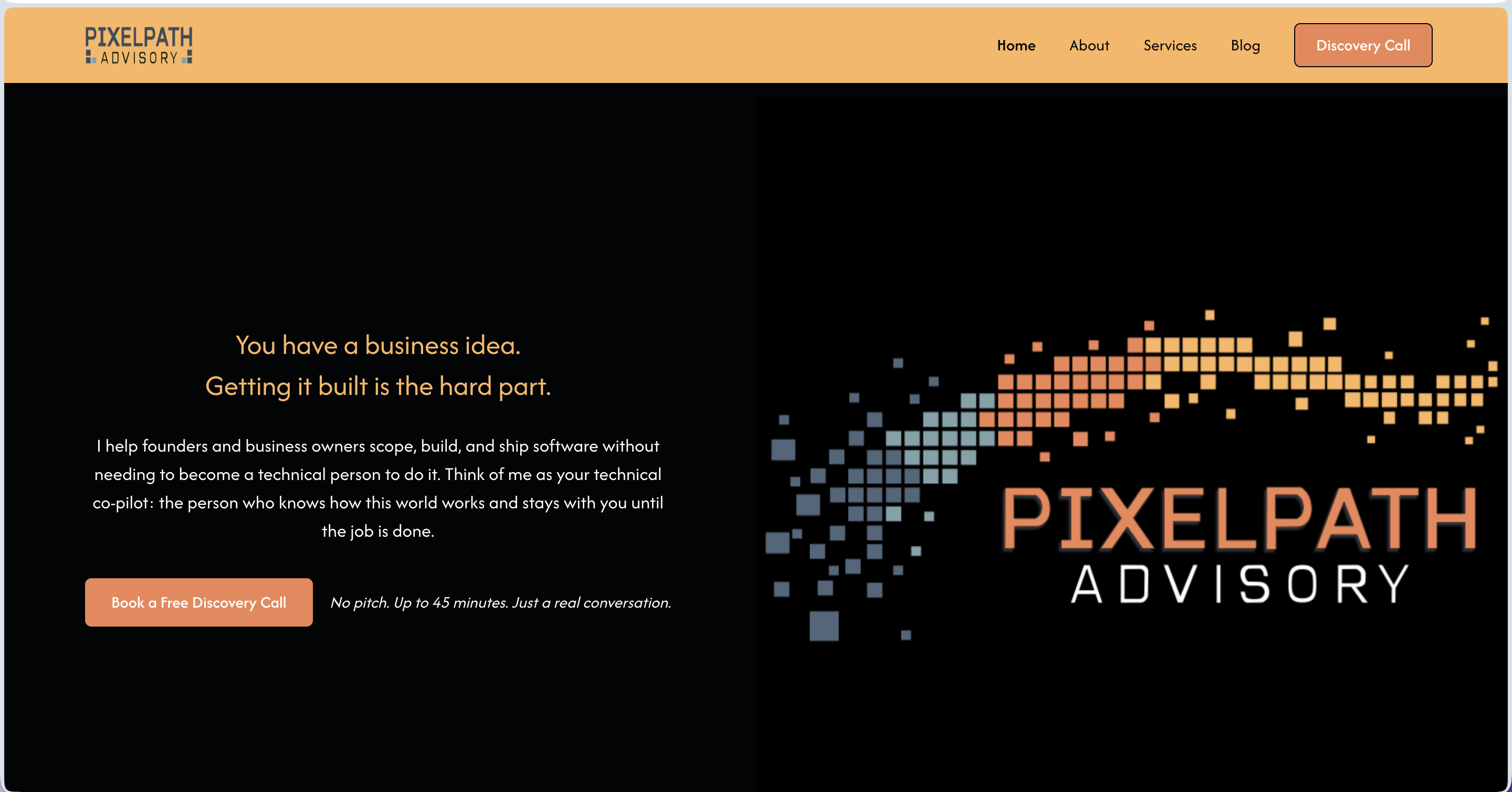
Micah came to me with a solid background, a clear service idea, and no brand to show for any of it. He had been operating informally and was ready to launch PixelPath Advisory LLC as a real business, but he had no logo, no website, no way to collect leads, and no system for onboarding clients. He also had a tendency to describe his work in technical terms his actual clients would never connect with.
I worked with Micah across the full brand and launch build: logo concepts, color palette, website copy for five pages structured around the StoryBrand framework, and a Webflow site build. I also set up a HoneyBook intake automation so his discovery call pipeline could run without him manually chasing every lead.
The copy work was where this project got interesting. Micah's instinct was to describe what he does in program management language. Getting him to speak directly to a non-technical founder, using words like "make sure you get what you paid for," changed the whole feel of the brand. That one phrase became the anchor for how we positioned his core value.
Micah launched with a brand identity, a live Webflow site, a working intake automation, and copy he could stand behind. The full system means he can send someone to his website today and have them booked into his pipeline without touching it himself.
Jenuine PR & Marketing
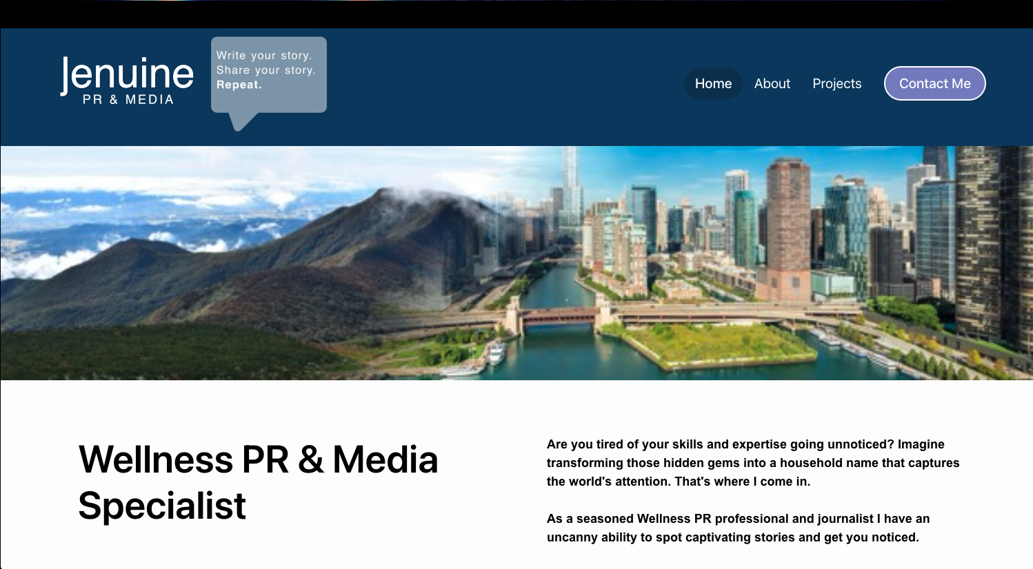
Jennifer had an established reputation in wellness PR, but her website needed to reflect the caliber of her results and make her value clear at a glance.
We elevated her digital presence with stronger messaging, cleaner design, and strategic proof points that highlight recognizable media wins.
The refreshed site guides visitors naturally toward contact while staying easy to update as new placements roll in.
Now her authority is visible within seconds.
Jennifer Clair Astrology
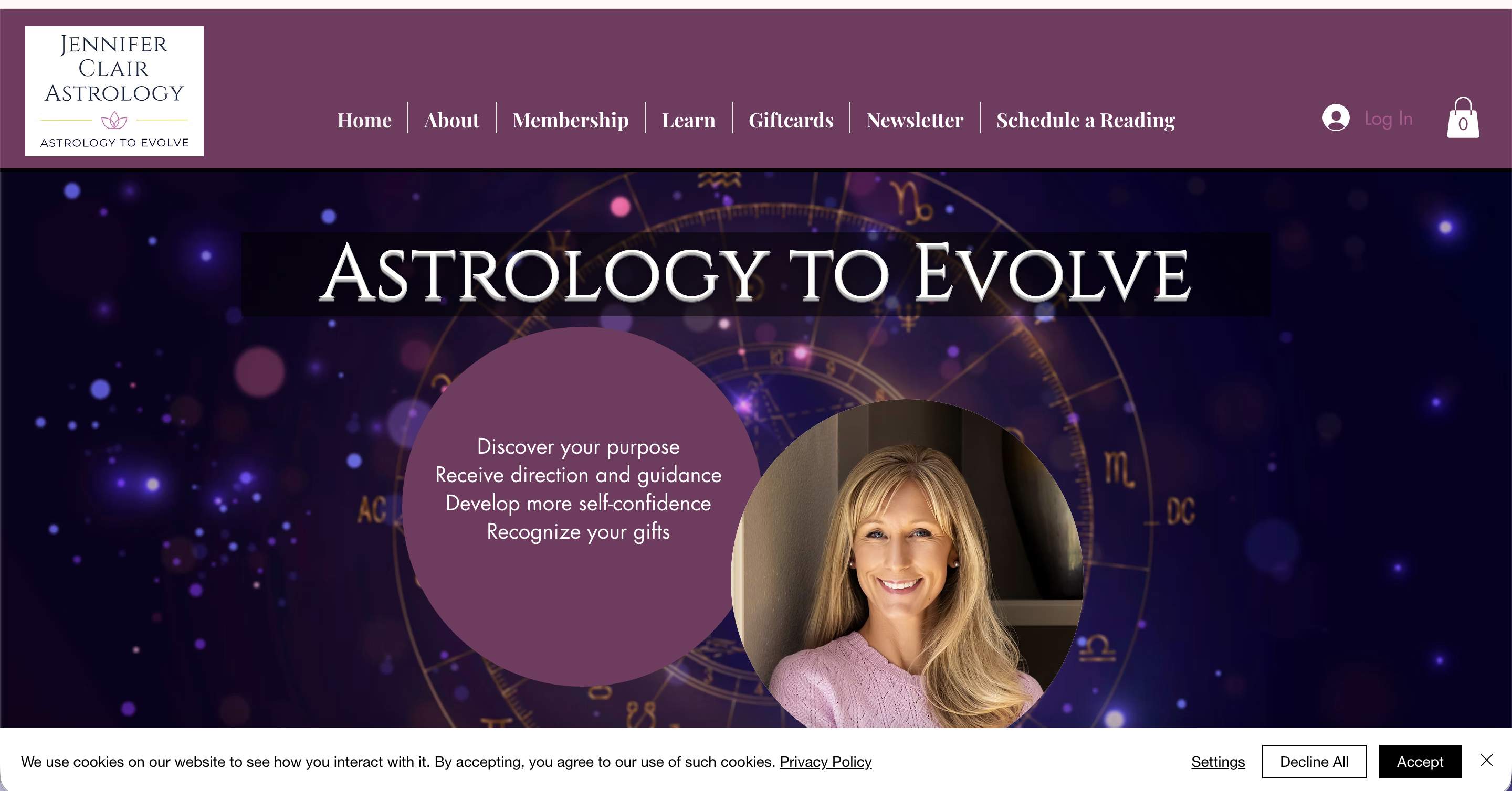
Jennifer had a Wix site she cared about, but keeping it updated on her own had become a real source of frustration. Every small change felt like a project, and over time the site started to fall behind where her business actually was.
I came in for a design sprint and worked through updates across the site with a focus on experience and clarity. From page content to navigation flow, we made sure the site felt as thoughtful and grounded as the work Jennifer does for her clients.
The piece I am most proud of is not any single update. It is the shift in how Jennifer relates to her site. She now has a partner. When something feels confusing or out of date, she does not have to figure it out alone. Her site stays current because she has someone helping her brainstorm what needs to change and why.
Jennifer's site now reflects where she actually is in her business, and she has the support to keep it that way. She is not managing it solo anymore, and that peace of mind shows up in how she shows up online.
Inner Beauty Esthetics
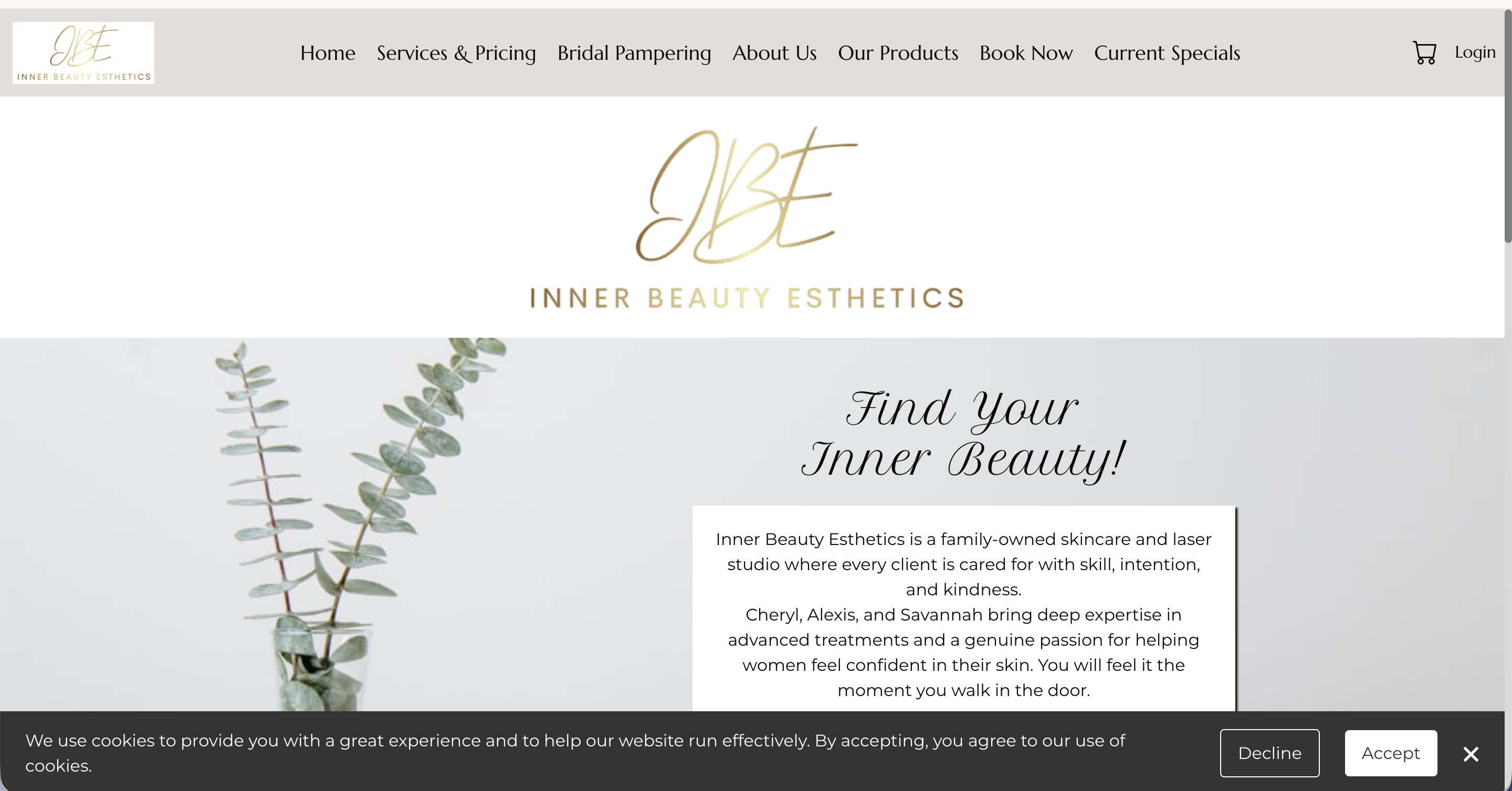
Inner Beauty Esthetics had a lot going for it already: strong services, beautiful photography, and a genuine story to tell as a family-owned mother-daughter business. What was missing was the foundation underneath. Key pages lacked title tags and meta descriptions, images had no alt text, header structure was inconsistent sitewide, and some of the most important content, including bridal packages, existed only inside graphics that search engines and screen readers couldn't read at all. The trust was there. The visibility and accessibility were not.
The work was a comprehensive SEO and accessibility optimization across the full site, part of an ongoing engagement. The homepage was rewritten and restructured to lead with the services and the family story, with testimonials integrated for social proof. Header hierarchy was corrected throughout, custom title tags and meta descriptions were written for every page, and alt text was added to images across the site. The About Us page was redesigned to better showcase the mother-daughter team, the Book Now page was enhanced with clearer booking guidance, and visual flow and readability were improved across multiple pages.
The Bridal Pampering page was the most impactful single change. A beautifully designed package graphic was holding all the bridal service information, which looked great but was completely invisible to search engines and screen readers. Converting that graphic into structured page content unlocked both accessibility and search visibility for bridal-related terms. Clients who couldn't previously find this information, or couldn't access it at all, now can.
The site kept its warmth and personality while gaining a much stronger foundation for organic search and inclusive access. Visitors can now more easily understand what's offered, connect with the family behind the business, and find their way to booking. The business is better positioned to attract new clients through search while providing a more welcoming experience for everyone who lands on the site. The relationship is ongoing, with periodic updates and optimization support as the business continues to grow.
Never Alone Consulting

Paula's site was holding together, but it had outgrown its structure. Everything important, her biography, media coverage, and resources, was buried inside a single long homepage, making it hard for visitors to scan or understand what she offered. The booking form was difficult to use, calls to action were easy to miss, and the site was still anchored to her previous work with DayBreak without clearly connecting visitors to her current focus, including the upcoming launch of A Place Like Home. For caregivers searching for support in an already stressful moment, none of that friction is workable.
Rather than a full rebuild, we did a strategic refresh inside Go High Level during a Design Sprint, reorganizing what was already there and building out what was missing. A dedicated About page and a dedicated Media page were created to pull key content out of the homepage and give it room to breathe. Navigation was simplified, calls to action were made more prominent, the booking form was repaired and resized, and page-specific SEO titles and meta descriptions were added throughout. Internal links connecting Never Alone Consulting to A Place Like Home were woven in to support both sides of Paula's work.
The most meaningful part of the project was helping Paula update her story. The revised About page honors the legacy of DayBreak and decades of dementia-care leadership, while making space for what comes next. A Place Like Home is now introduced in a way that feels connected rather than separate, so visitors can understand the full arc of Paula's work and where she's headed. That kind of narrative transition is easy to get wrong. This one landed well.
The site now reads more like a professional resource than a packed homepage. Visitors can quickly identify who Paula helps, what she offers, and how to reach her. The structure supports both her consulting practice and her ongoing leadership role as A Place Like Home takes shape. The relationship is continuing, with Paula reaching out for strategic support and website expertise as her next chapter unfolds.
P.U.L.S.E. Strategies

Charlotte was launching P.U.L.S.E. Consulting and quickly found out that starting a business means wearing a dozen hats at once. Building a website was one task too many.
In two days, she had a polished, client-ready Squarespace site that communicated her expertise clearly and gave her a professional home base from day one.
The site covers her tiered consulting packages, a clear path to booking a discovery call, and a newsletter opt-in to grow her audience over time.
Charlotte arrived overwhelmed. She left with a site that was ready for clients.
Teefs Pet Sitting

Aurora found me through a networking community with a clear goal: stop explaining her business over and over in person and let her website do the work instead.
We built a warm, professional site for Teefs Pet Sitting that helps potential clients find her, learn about her services, and start the booking process without having to pick up the phone first.
Now Aurora can focus on what she actually loves, caring for pets, while her website handles the first impression.
Her energy going into the project matched her enthusiasm for the launch. She loved it so much that she brought Lizzy back for her husband's business rebrand too.
Elevating Profits LLC
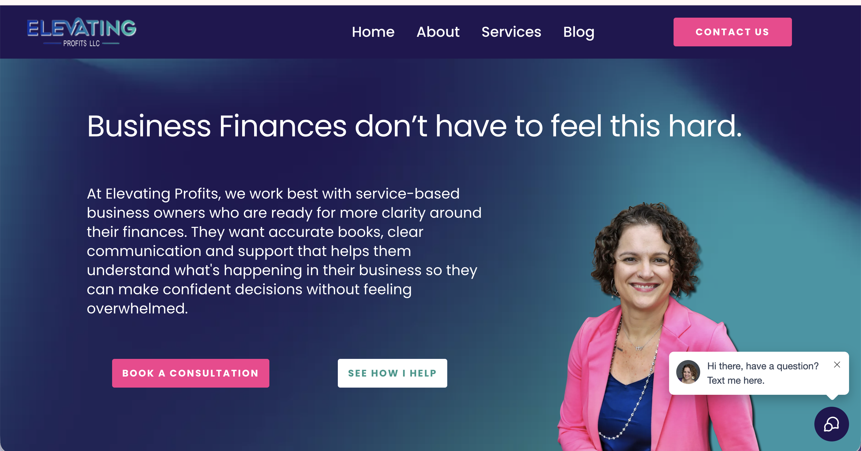
Mandy's business had grown in ways her website hadn't kept up with. Her services had evolved into distinct tiers of support, bookkeeping, consulting, and CFO-level work, but the site didn't reflect that progression. Visitors had no clear way to identify which level was right for them, and the site wasn't positioned to do much work between client conversations.
We completed a full redesign and restructure inside Go High Level during a Design Sprint, rebuilding the site across six pages: Home, About, Services, Contact, Blog, and a custom 404. We refined her service positioning to create clear pathways between each tier, integrated a lead magnet with automated delivery, migrated and organized her blog content, added SEO-focused FAQs, built internal anchor navigation between service sections, and set up custom redirects from legacy URLs. Updated branding assets and mobile-responsive design were carried through every page.
The most meaningful piece of this project wasn't a single page. It was a system. Visitors who aren't ready for ongoing services are now guided toward Mandy's Financially Focused Journal through strategic placement on the Services page and an exit-intent popup. A journal purchase triggers automated payment processing, order confirmation, business notifications, and fulfillment reminders. What had previously existed outside the site is now a fully integrated revenue stream that requires zero manual work on Mandy's end.
The finished site reflects Mandy's expertise, personality, and the full range of what she offers. Prospective clients can quickly identify the right level of support, and those who aren't ready for monthly services have a lower-commitment entry point into her world. The automations, payment systems, and lead nurturing running in the background reduce the manual work that used to fall on her plate. This is an ongoing client relationship, with continued support, updates, and future enhancements planned as her business grows.
Thrify Gents

Thrifty Gents Floral needed a refreshed website to match the charm of their growing floral business. Transforming their outdated template into a customized design masterpiece, this site now showcases their work beautifully while enhancing credibility and customer trust.
Deez Muttz Dog Grooming

At Deez Muttz LLC, they offer top-quality mobile pet grooming services that will keep your furry friend looking and feeling their best. The bold colors, passion for their work, and photos of adorable dogs made this project extra fun! (Who doesn't want to spend a day picking cute pup photos?)
Prosperity Through Property

Elizabeth has a passion for helping others build generational wealth, and she created Prosperity Through Property to make that education fun and accessible through a board game.
The site had to do a lot at once. It needed to introduce and sell the game, give real estate professionals a clear path to hosting their own game nights, and function as an interactive calculator so players can enjoy the full experience without stopping to do the math.
That calculator is the standout feature, built from scratch to keep players focused on strategy instead of arithmetic.
Now the site works as hard as the mission behind it.
Precision Hydraulics

The Hayworth family has been serving their community through Precision Hydraulics since 1975. Their website hadn't kept up. It was outdated, not mobile responsive, and not driving any traffic. Their expertise deserved better.
We refreshed the site completely, giving it vivid imagery, a polished layout, and a mobile-friendly build that actually works for how people search today.
What I didn't expect was how much fun a hydraulics site could be. The Hayworths are warm, passionate people who love what they do, and that comes through in every corner of the project.
Gina described the process as painless, which is exactly what a refresh like this should feel like.
The Constant Cleaner

Before this redesign, The Constant Cleaner was relying on an expensive CRM that was overkill for their needs. Now, they have a cost-effective, easy-to-update solution that allows them to manage their services without unnecessary complexity.Their new site highlights their residential and commercial cleaning services, makes it simple for clients to get in touch, and reflects their commitment to a spotless, stress-free experience.